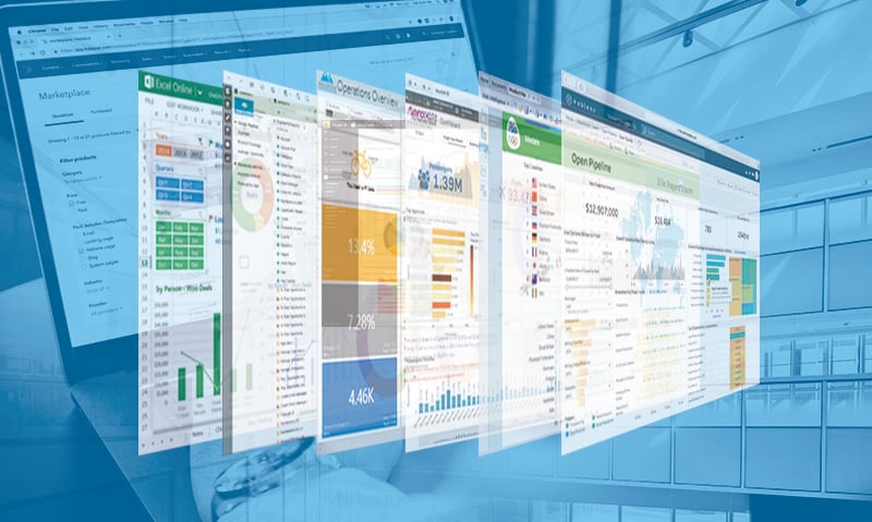
Data visualization is becoming increasingly important for business decision making. Here are the main data visualization tools.
Today, implementing a business intelligence tool in the company does not only allow for the extraction, organization and storage of the data generating a list of corporate reports, but it also offers the user reports that are impressive, interactive and immediate.
If the user wants to know "what territory had the lowest order conversion rate last month", they want to be able to ask it in their own language and get an answer that allows them to see directly what they are looking for and easily navigate to the origin of the situation or its side effects.
If they are also offered a personalized result, with all the information they need in one place, mobile access if required, automatic updates as often as necessary and the ability to evolve/modify what they are seeing to suit their specific requirements, they are given the freedom to explore and discover new perspectives and, ultimately, make timely, informed and secure decisions in their company.

What tools can I use to get all this?
MS Excel
Excel is not the first tool we think of when we talk about data visualization in a Business Intelligence system, but it is the most used analytical tool by business users, as it is very accessible. No other solution has the capacity to reach one billion users through tools they already know and use. Today, Excel offers end-to-end self-service BI functionality through capabilities such as Power Query, Power Pivot, Power View, and Power Map. With Excel's accessibility, the accuracy given by the connection to analytics services, and the proliferation of Office 365, the entry barrier is reduced for businesses that want to start reaping the benefits of business intelligence.
Power BI
Power BI, Microsoft's business intelligence tool, allows us to incorporate data from different sources and create a model that allows us to relate them for later visualization. We have the possibility to analyze our information and share it with other users of the company both online and offline, in the office or through mobile devices.
For this we have the following components at our disposal:
- Power BI Desktop: it is the tool in which the data connection, the model and the reports will be created.
- Power BI Service: is the service that allows the publication and sharing of reports so that they can be viewed and edited by other users of the organization with permissions.
- Power BI Mobile: allows the generation of specific formats for viewing on mobile devices from the initial report.
- Power BI Pro: This is a publishing license for organizations that need to integrate large amounts of data for a large number of users, with constant refresh.
- Power BI Embedded: allows the publication of Power BI reports in our applications and portals through web services, SDK and APIs, without the need for licensing or authentication by the end user other than the application itself.
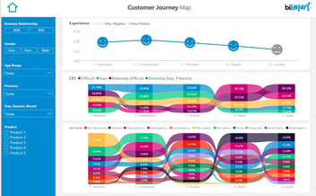
Using visual objects in Power BI Desktop is one of the easiest ways to generate and share reports with our data. It has multiple standard visuals that are incorporated into the reports without the need for programming (graphics, tables, interactive maps...), with a very large Marketplace maintained by the user community and also has the ability to create our own custom visual objects and pack them as a file so they can be imported into any Power BI report we want to generate.
If we also need to transform and model the data obtained from the source before painting them, we can execute DAX functions to obtain calculated columns and metrics.
Pyramid
Pyramid is a product by the company Pyramid Analytics, which focuses on Business Analytics and is based in Amsterdam. It offers self-service analytics services as well as BI systems.
Pyramid consists of six modules: modeling, discovery, formulation, illustration, presentation and publication. The illustration module, which is the subject of this post, allows users to create graphs based on data, texts and infographics ready to present or publish. Pyramid offers 36 graphics, which can be extended to more than 150 different views. In particular, this tool offers:
- Dynamic infographics.
- Reusable content that can be shared in presentations and publications.
- Dynamic text based on data.
- Composite visualizations (images in SVG and raster layers).
- Custom visual workflows to illustrate processes.
Tableau
Tableau is an American company recently acquired by the customer management software giant Salesforce. Gartner has considered it a leader in its Magic Quadrant for several years, even though it has been superseded by Microsoft in recent years.
Tableau is a data visualization tool that helps simplify data and convert it into easily understandable formats. This tool allows the creation of dashboards and worksheets, as well as fast data analysis. The visualizations you get with Tableau are simple, so even non-technical users can easily unwrap with the tool.
With Tableau we can:
- Create graphs and dashboards showing KPIs.
- Share reports and dashboards with team members who have access to the tool.
- Easily explore data thanks to an interactive user interface.
- The tool can connect to more than 60 different data resources such as Microsoft SQL Server, Spark SQL, Amazon Redshift or Hadoop Hive Server.
QlikSense
QlikTech is a company founded in Sweden in 1993 and now headquartered in the USA. It is a Business Intelligence company focused on business discovery.
Its QlikSense tool allows non-technical users to view data and ask questions. The goal of QlikSense is to allow you to ask and answer questions that arise from the graphical representation of data.
QlikSense enables to:
- Explore visual views of information through simple interactions.
- Ask any question regarding data visualization.
- Intelligent, innovative, fully interactive and responsive visualizations.
- Explore in any direction.
- Intelligent search.
- Collaborate and share information extracted from visual analysis.
Business Objects
Business Objects was born in 1990 in Paris and was acquired by the German SAP in 2008.
Business Objects has a reporting and business intelligence tool, which offers reporting applications that allow users to discover information, analyze and achieve data insights, and create reports that enable clear visualization of this data. Business Objects has two products, Business Objects Edge Edition, aimed at mid-sized companies, and Business Objects Enterprise, which is aimed at large corporations.
Business Objects allows to:
- Create BI visualizations and dashboards that allow risk assessment, improve efficiency and highlight insights.
- Self-service ad-hoc reporting, query, and analysis.
- Interaction with reports and metrics even through mobile devices.
- Data search and navigation, multidimensional fronts, BI workspaces.
- Metadata layers, object life cycle control, multilanguage tools...
Microstrategy
Microstrategy is an American company founded in 1989 that offers OLAP and BI software.
Microstrategy has a business intelligence tool whose platform supports interactive dashboards, formatted reports, report distribution, etc.
With Microstrategy we can:
- Discover new insights with powerful visualizations, thanks to its graphics library.
- Visualize data quickly with maps, diagrams and graphs.
- Use third party visuals like D3 or create your own graphics with your Visualization Builder and SDK.
- Create data Discovery dossiers.
When choosing the data visualization tool we must take into account aspects such as its connection capabilities with the tools we currently have, the cost of licensing, what type of users will handle it, its scalability, ease of use and the product life cycle offered by its manufacturer.
Anna Farrés | Presales Manager