Explore the best data visualization tools for modern businesses. Learn about Power BI, Tableau, Qlik, and Google Data Studio.
In today's information age, data stands as the most valuable asset for any company. However, the challenge lies in how to interpret and harness that wealth of information to make strategic decisions.
This is where data visualization comes into play: a powerful tool that transforms numbers into clear and meaningful visual insights.
In this article, we will explore what data visualisation is, why it is vital for modern businesses and the best data visualisation tools available to master this discipline.
Before we get started...
Download our free ebook and find out how to power your analytics with the best Power BI visuals! Get exclusive access to a curated collection of data visualisations that will help you take your reports and dashboards to the next level.
What is Data Visualization?
Data visualisation is the process of representing complex information in clear and understandable visual forms, such as graphs, charts and interactive tables.
In the world of business intelligence (BI) and business, data visualisation plays a critical role in turning mountains of data into actionable insights.
By providing a visual representation of data, data visualisation tools enable users to quickly understand information, identify trends, patterns and relationships, and make informed decisions in real time.
Furthermore, in an increasingly data-driven business environment, data visualisation facilitates communication and collaboration between teams and stakeholders by providing a common understanding of data and aligning business strategies with organisational goals and objectives.
Why is data visualization important?
La importancia de la visualización de datos radica en su capacidad para transformar datos en conocimiento accionable. Aquí hay algunas razones clave por las que las empresas deberían prestar atención a esta práctica:
- Enhances Understanding: Humans are inherently visual creatures. Data visualization transforms overwhelming information into easy-to-understand graphs and diagrams, making interpretation and decision-making a breeze.
- Spot Trends and Patterns: By representing data in various visual forms, it becomes easier to identify trends, patterns, and anomalies that may otherwise go unnoticed in spreadsheets or static reports.
- Boosts Collaboration: Data visualizations are powerful tools for communicating ideas and findings within teams and organizations. They foster collaboration by providing a common understanding of data among different stakeholders.
- Strengthens Persuasion: Effective visualizations can be compelling. By presenting data clearly and persuasively, businesses can influence others' opinions and support their arguments with visual evidence.
The Best Data Visualization Tools
1. Microsoft Power BI
Developed by Microsoft, Power BI is a market-leading tool that allows users to visualise and share data in an intuitive way. Its integration with other Microsoft tools makes it a popular choice for companies already using the Microsoft ecosystem.
In addition, it is important to note that Power BI has been chosen as the leading tool in Gartner's Magic Quadrant for 3 consecutive years, underlining its position as a market-leading solution.
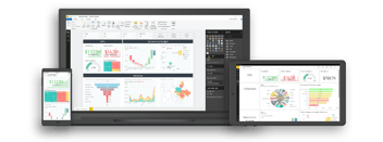
Data analysis and visualisation with Power BI offers an unparalleled experience in terms of ease of use, analytical power and customisability. Its wide range of interactive visualisations and its ability to create dynamic reports and custom dashboards make it an indispensable tool for businesses of all sizes.
Download our free ebook and master Power BI with the best visuals! Optimise your analysis with our selected visualisations, get yours now!
Microsoft Power BI: Outstanding capabilities
- Data Connectivity: Power BI enables users to connect to a wide range of data sources, including local databases, cloud services, files, and enterprise applications.
- Data Transformation: The tool offers robust data preparation capabilities that allow users to clean, transform, and merge data quickly and efficiently.
- Interactive Visualization: Power BI offers a diverse array of interactive visualizations, including charts, tables, maps, and diagrams, empowering users to explore data and uncover insights intuitively.
- Dashboards and Scorecards: Users can craft personalized dashboards and scorecards to monitor real-time business performance and share insights with colleagues and stakeholders.
- Microsoft Tool Integration: Power BI seamlessly integrates with other Microsoft tools, such as Excel, SharePoint, and Azure, facilitating collaboration and data exchange across different applications.
Microsoft Power BI: Advantages
- Ease of use: Power BI offers an intuitive and user-friendly interface that empowers users to effortlessly create data visualizations and dashboards without the need for advanced programming or data analysis knowledge.
- Scalability: The tool is highly scalable and can handle datasets of any size, from small local databases to large cloud data warehouses.
- Seamless integration with Microsoft's ecosystem: Power BI seamlessly integrates with other Microsoft tools and services, fostering collaboration and integration with existing enterprise applications.
- Regular updates: Microsoft delivers periodic updates to Power BI with new features and enhancements, ensuring users always have access to the latest tools and functionalities.
Microsoft Power BI: Weaknesses
- Cost: While Power BI does offer a free version, accessing some advanced features may necessitate a paid subscription, which could be costly for certain organizations.
Looking to unlock the full potential of Power BI Premium without breaking the bank?
- Learning curve: Although the tool is relatively easy to use, it can take time for users to fully master all of its features and functionalities.
- Internet dependency: Power BI is a cloud-based tool, which means that users need access to the Internet to use all of its features and functionalities, which can be a problem in environments with limited connectivity.
- Data Governance: While Power BI offers robust security features, such as the ability to define user roles and permissions, as well as encryption of data in transit and at rest, it can be a challenge for organisations to maintain complete control over who can access, share or modify data on the platform. The lack of centralised data governance in Power BI can make it difficult to consistently enforce security and privacy rules across the organisation, which can lead to data protection gaps and potential compliance risks.
At Bismart, as a Microsoft Power BI Preferred Partner, we are proud to offer advanced data visualisation and analytics solutions that leverage the full potential of Power BI. Our team of data experts work closely with Microsoft to provide our customers with the tools and expertise to take full advantage of this powerful business intelligence platform.
2. Tableau
Considered one of the best data visualisation tools on the market, Tableau offers a wide range of features for creating interactive visualisations and custom dashboards.
Tableau: Outstanding capabilities
- Data Connectivity: Tableau empowers users to seamlessly connect to a diverse array of data sources, ranging from databases and spreadsheets to cloud files and enterprise applications.
- Interactive Visualization Creation: With a plethora of visualization options at their disposal, including graphs, maps, tables, and scatter plots, users can craft personalized and interactive visualizations with ease.
- Real-Time Data Analysis: Tableau delivers advanced real-time data analysis capabilities, enabling users to dynamically explore and filter data to unveil insights on the fly.
- Dashboard and Scorecard Development: Users have the flexibility to design custom dashboards and scorecards to visually showcase key data and share insights with colleagues and stakeholders.
- Collaboration and Sharing: Tableau streamlines information exchange and collaboration by enabling users to share visualizations, dashboards, and analyses with others through the Tableau cloud platform.
Tableau: Advantadges
- User-Friendliness: Tableau offers an intuitive and user-friendly interface that empowers users to effortlessly create data visualizations and dashboards without the need for advanced programming or data analysis skills.
- Advanced Visualization: The tool provides advanced visualization capabilities, enabling users to craft highly customized and interactive visualizations for effective data exploration and presentation.
- Integration with Other Tools and Platforms: Tableau seamlessly integrates with a wide range of tools and platforms, streamlining collaboration and integration with existing enterprise applications.
- Active Community: Tableau boasts an active community of users and developers who share resources, tips, and tricks, fostering a conducive environment for learning and problem-solving.
Tableau: Weaknesses
- Cost: Tableau may come with a hefty price tag for some organizations, particularly those in need of advanced features or dealing with large volumes of data.
- Learning curve: While Tableau is relatively user-friendly, it may take some time for users to fully familiarize themselves with all its features and functionalities.
- Internet dependency: Being a cloud-based tool, Tableau requires users to have internet access to utilize all its features, which can pose a challenge in environments with limited connectivity.
3. QlikView/Qlik Sense
QlikView and Qlik Sense are powerful data visualisation solutions that allow users to explore data and discover insights intuitively. Their ability to dynamically associate data makes it easy to discover relationships between different data sets.
Qlik: Standout Capabilities
- Data Association: QlikView and Qlik Sense employ a unique data association approach that empowers users to dynamically explore relationships between different datasets without the need for prior data modeling.
- Interactive Visualization: Both tools offer a wide array of interactive visualizations, including graphs, tables, maps, and diagrams, enabling users to create customized visualizations to effectively explore and present data.
- Guided Data Discovery: QlikView and Qlik Sense provide advanced analytical capabilities that allow users to intuitively explore data and uncover significant insights without the requirement of technical or data analysis knowledge.
- Dashboard and App Creation: Users have the ability to craft personalized dashboards and applications to visually showcase key data and share insights with colleagues and stakeholders.
Qlik: Advantadges
- Dynamic data association: The ability to dynamically associate data in QlikView and Qlik Sense empowers users to intuitively explore relationships between datasets and uncover meaningful insights.
- Guided data discovery: QlikView and Qlik Sense offer advanced analytical capabilities that enable users to explore data intuitively and discover significant insights without the need for technical or data analysis knowledge.
- Collaboration and sharing: QlikView and Qlik Sense streamline information sharing and collaboration by allowing users to share visualizations, dashboards, and analyses with others through the Qlik cloud platform.
Qlik: Weaknesses
- Infrastructure: Implementation at a large scale demands a dedicated server infrastructure.
- Steep initial learning curve for new users on the platform.
- Integration: Challenges in integrating with other tools and technologies.
4. Google Data Studio
Google Data Studio is a cutting-edge data visualization platform developed by Google, offering users the ability to create interactive reports and dashboards using data from various sources. With its intuitive interface and powerful visualization capabilities, Google Data Studio streamlines the exploration and communication of insights through customized visualizations.
Highlighted Features of Google Data Studio:
- Versatile data connection: Google Data Studio enables users to seamlessly connect data from a wide range of sources, including cloud databases, spreadsheets, web services, and analytics tools, making it easy to integrate multiple data sets into a single report.
- Interactive report creation: The platform offers a diverse selection of interactive visualizations, such as charts, tables, maps, and diagrams, empowering users to craft personalized and highly interactive reports for effectively presenting data in a clear and engaging manner.
- Advanced customization: Google Data Studio provides advanced customization options that allow users to tailor the design, styles, and filters of their reports to suit the specific needs of their audience, offering flexibility and control over the appearance of the reports.
- Collaboration and sharing: Users can collaborate on reports and dashboards in real-time and share them with colleagues and stakeholders through shared links or integration with other Google tools like Google Drive and Google Sheets, streamlining collaboration and efficient information distribution.
Advantages of Google Data Studio:
- Free of charge: Google Data Studio is a no-cost tool that offers a wide range of functionalities, making it an appealing choice for businesses of all sizes, especially those with limited budgets.
- Seamless integration with the Google ecosystem: The integration with other Google tools and services such as Google Analytics, Google Ads, and Google Sheets simplifies data connection and analysis, enabling users to fully leverage the Google ecosystem for actionable insights.
- User-friendly interface: Google Data Studio provides an intuitive and easy-to-use interface that doesn't require advanced technical knowledge, allowing users to create reports and dashboards quickly and effortlessly without the need for specialized training.
- Regular updates: Google Data Studio receives periodic updates with new features and enhancements, ensuring that users always have access to the latest tools and functionalities to enhance their data analysis and visualization experience.
Weaknesses of Google Data Studio:
- Limited integration: Restrictions in connecting with local and private data sources may pose challenges for users.
- Additionally, the complexity in creating advanced visualizations compared to other tools could hinder seamless data visualization.
- Moreover, the platform's dependency on internet connectivity for access and usage may limit its accessibility in certain situations.
5. D3.js
D3.js is a widely used JavaScript library for creating custom, highly interactive data visualisations. It is ideal for developers who want full control over the design and interactivity of their visualisations.
D3.js: Outstanding Capabilities
- Customized visualization creation: D3.js empowers users to craft highly personalized data visualizations using HTML, SVG, and CSS. This grants complete control over the design and interactivity of the visualizations, enabling users to create unique data experiences tailored to their specific needs.
- Dynamic data manipulation: D3.js provides robust data manipulation capabilities that allow users to transform and manipulate data in real-time. This facilitates the creation of dynamic visualizations that respond to changes in the data, enabling interactive exploration.
- Advanced interactivity: The library offers a wide range of tools to add interactivity to visualizations, such as mouse events, zoom and pan, data selection and filtering, and animations. This enables users to create visualizations that respond to user interaction, facilitating data exploration and understanding.
- Multi-platform compatibility: D3.js is compatible with a variety of platforms and web technologies, including modern browsers, web applications, and development frameworks like React and Angular. This allows users to easily integrate D3.js visualizations into their existing applications and maximize their functionality.
Advantages of D3.js:
- Versatility and control: D3.js offers unparalleled flexibility and control in creating and customizing data visualizations. This empowers users to design unique and tailored visualizations that meet their specific needs, without being constrained by predefined tools.
- Active community: D3.js boasts a vibrant community of developers and users who share resources, tutorials, and code examples, making learning and problem-solving a breeze. Additionally, the library receives regular updates with new features and enhancements based on community feedback.
- Free and open-source: D3.js is an open-source and free library, allowing anyone to use and contribute to its development. This accessibility makes it suitable for a wide range of users, from individual developers to large enterprises, without the need for licensing costs.
- Scalability: D3.js is highly scalable and can handle datasets of any size, from small static datasets to large streams of real-time data. This makes it suitable for a variety of applications, ranging from simple visualizations to complex and dynamic web applications.
Challenges and Limitations of D3.js:
- Steep learning curve: D3.js presents a steep learning curve, especially for those unfamiliar with web programming concepts, SVG (Scalable Vector Graphics), and DOM (Document Object Model) manipulation. New users may need significant time and effort to master the library fully and unleash its full potential.
- Complexity in advanced visualization creation: While D3.js offers unmatched flexibility in crafting customized visualizations, this freedom can lead to increased complexity in implementation. Developing advanced and highly interactive visualizations may require a deep understanding of visualization design principles, as well as advanced skills in JavaScript and SVG.
- Maintenance and compatibility: Due to its open-source nature and ever-evolving community, maintaining and ensuring compatibility can be challenging. Frequent updates and changes in underlying web technologies may necessitate constant code adjustments, and backward compatibility may not be guaranteed, leading to the need for frequent updates and careful documentation tracking.
- Performance with large datasets: Despite being highly flexible and scalable, D3.js's performance may be impacted when working with extremely large datasets or creating complex visualizations. Real-time manipulation of large amounts of data may require additional optimizations and efficient visualization strategies to ensure a smooth and responsive user experience.
6. Plotly
Plotly is a charting library and data visualisation tool that offers advanced charting and dashboarding capabilities. Its focus on interactivity makes it ideal for web applications and exploratory data analysis.
Plotly's Outstanding Capabilities:
- Interactive Visualisations: Plotly allows the creation of interactive visualisations, which means users can explore and manipulate data directly on the graph, making it easy to identify patterns and trends.
- Multiple Language Support: Plotly supports multiple programming languages, including Python, R, JavaScript and MATLAB, allowing users to create visualisations in their preferred environment.
- Graphics Diversity: The library offers a wide variety of graphics, from simple line graphs to geospatial maps and 3D scatter plots, allowing users to represent data in different ways according to their needs.
- Advanced Customisation: Plotly allows users to customise every aspect of their visualisations, including colours, labels, titles and axes, allowing them to tailor visualisations to their specific needs.
Advantages of Plotly:
- Ease of Use: Plotly offers an intuitive and user-friendly interface that empowers users to create data visualizations without the need for advanced programming or design knowledge.
- Interactivity: The ability to create interactive visualizations allows users to dynamically explore data and gain meaningful insights quickly and efficiently.
- Multi-platform Compatibility: Plotly is compatible with a variety of platforms and development environments, making it easy to integrate into web applications, Jupyter notebooks, desktop applications, and more.
- Active Community: Plotly boasts an active community of users and developers who share resources, tutorials, and code examples, facilitating learning and problem-solving.
Weaknesses of Plotly:
- Learning Curve: Although Plotly is relatively easy to use, it can take time for users to become fully familiar with all of its features and functionalities.
- Limitations in the Free Version: Some advanced features of Plotly may require a paid subscription, which may result in limitations for those who choose to use the free version of the tool.
- Performance on Large Datasets: Real-time manipulation of large amounts of data can affect the performance of visualisations, which may require additional optimisations and efficient visualisation strategies to ensure a smooth and responsive user experience.
7. Matplotlib/Seaborn
Matplotlib and Seaborn are two popular Python data visualisation libraries used by data scientists, researchers and developers to create static and dynamic graphs. These tools are widely used in the Python community because of their versatility and ability to generate high-quality visualisations.
Matplotlib/Seaborn Outstanding Capabilities:
- Wide Variety of Charts: Matplotlib and Seaborn offer a wide variety of charts, including line charts, bar charts, scatter charts, histograms, box plots, contour plots and more, allowing users to represent data in different ways according to their needs.
- Advanced Customisation: Both libraries allow users to customise every aspect of their visualisations, including colours, styles, labels, titles and axes, allowing them to tailor visualisations to their specific needs.
- Multiple Platform Support: Matplotlib and Seaborn support a variety of platforms and development environments, including Jupyter Notebook, desktop applications and web servers, making it easy to integrate into different projects and applications.
- Integration with Pandas and NumPy: Both libraries integrate seamlessly with Pandas and NumPy, two popular Python data analysis libraries, allowing users to efficiently work with structured data and perform complex analysis.
Advantages of Matplotlib/Seaborn:
- Ease of Use: Matplotlib and Seaborn provide an intuitive and user-friendly interface that empowers users to swiftly and easily create data visualizations, even for those with limited programming experience.
- Extensive Documentation and Resources: Both libraries offer a wealth of documentation and an active community of users and developers who share resources, tutorials, and code examples, simplifying the learning process and problem-solving.
- Versatility: Matplotlib and Seaborn are versatile tools that can be utilized for a wide range of applications, from data exploration and analysis to report generation and presenting results.
- Jupyter Notebook Compatibility: The integration with Jupyter Notebook allows users to create interactive visualizations directly within their notebooks, enhancing the exploration and communication of insights.
Weaknesses of Matplotlib/Seaborn:
- Steep initial learning curve for newcomers to Python programming.
- Limitations in creating interactive visualizations compared to other tools.
- Advanced programming knowledge required for efficiently customizing visualizations.
8. Looker
Looker is a business intelligence platform that enables organisations to explore and analyse data for actionable insights. In addition to offering data analysis capabilities, Looker also provides advanced visualisation tools that allow users to create interactive reports and dashboards to effectively communicate insights.
Outstanding Capabilities of Looker:
- Data Exploration: Looker empowers users to intuitively explore data using filters, groupings, and custom metrics, simplifying the identification of patterns and trends within the data.
- Data Modeling: The platform provides advanced data modeling tools that enable users to create customized data models to represent the structure and relationships between different data sets.
- Report and Dashboard Creation: Looker enables users to create interactive reports and dashboards using a wide variety of visualizations, including charts, tables, and diagrams, facilitating effective communication of insights.
- Collaboration and Sharing: Users can collaborate on reports and dashboards in real-time and share them with colleagues and stakeholders through shared links or integrations with collaboration tools such as Slack and Google Workspace.
Advantages of Looker:
- Ease of Use: Looker provides an intuitive and user-friendly interface that empowers users to explore and analyze data without requiring advanced knowledge of data analysis or programming.
- Advanced Customization: The platform enables users to personalize reports and dashboards with branded logos, corporate colors, and custom design styles, allowing them to tailor visualizations to their organization's specific needs.
- Scalability: Looker is highly scalable and can handle datasets of any size, from small local databases to large cloud data warehouses, making it suitable for businesses of all sizes.
- Integration with Other Tools: Looker seamlessly integrates with a variety of third-party tools and services, including Salesforce, Google Analytics, and Amazon Redshift, facilitating integration with existing enterprise applications and data exchange across different platforms.
Looker's weaknesses:
- Cost: Looker can be costly for some organisations, especially those requiring advanced features or large volumes of data, which may limit its accessibility for smaller businesses or those with limited budgets.
- Learning Curve: Although Looker is relatively easy to use, it can take time for users to become fully familiar with all of its features and functionality, which may require additional training and support resources.
- Internet dependency: Looker is a cloud-based tool, which means that users need access to the internet to use all of its features and functionalities, which can be an issue in environments with limited connectivity.
9. Sisense
Sisense is a business intelligence platform that provides organisations with advanced data analytics and visualisation capabilities. With an in-memory data architecture and intuitive interface, Sisense enables users to explore large volumes of data and gain actionable insights quickly and efficiently.
Outstanding Sisense Capabilities:
- Data Consolidation: Sisense allows users to consolidate data from multiple sources into a single data warehouse, making it easy to integrate and analyse data from different systems and applications.
- Interactive Visualisations: The platform offers a wide variety of interactive visualisations, including graphs, charts, maps and diagrams, which allow users to explore and present data effectively.
- Advanced Analytics: Sisense provides advanced data analytics tools, including predictive modelling and time series analysis, enabling users to uncover hidden insights and make informed decisions.
- Scalability: Sisense's in-memory architecture enables rapid processing of large volumes of data, making it suitable for businesses of all sizes, from small startups to large corporations.
Advantages of Sisense:
- Ease of Use: Sisense offers an intuitive, easy-to-use interface that allows users to create and customise reports and dashboards without the need for advanced data analysis or programming skills.
- Performance: Sisense's in-memory architecture ensures fast and efficient performance, allowing users to perform real-time analysis and gain instant insights.
- Integration with other tools: Sisense integrates with a wide variety of third-party tools and services, including Salesforce, Google Analytics and Amazon Redshift, making it easy to integrate with existing enterprise applications and share data across platforms.
- Security and Compliance: Sisense offers advanced security and compliance features, including data encryption and role-based access control, ensuring protection of sensitive data and compliance with privacy regulations.
Weaknesses of Sisense:
- Cost: Sisense can be expensive for some organisations, especially those requiring advanced features or large volumes of data, which may limit its accessibility for smaller companies or those with limited budgets.
- Learning Curve: Although Sisense is relatively easy to use, it can take time for users to become fully familiar with all of its features and functionality, which may require additional training and support resources.
- Internet dependency: Sisense is a cloud-based tool, which means that users need access to the Internet to use all of its features and functionalities, which can be an issue in environments with limited connectivity.
10. Periscope Data
Periscope Data is a data analysis tool that enables organisations to explore, analyse and visualise large volumes of data quickly and efficiently. With an intuitive interface and advanced visualisation capabilities, Periscope Data helps users make informed decisions based on actionable insights.
Featured Capabilities of Periscope Data:
- Connecting to Multiple Data Sources: Periscope Data allows users to connect data from multiple sources, including cloud databases, data warehouses, web services and local files, making it easy to integrate and analyse data from different systems and applications.
- Advanced Analytics: The platform offers advanced data analytics tools, including predictive modelling, time series analysis and customer segmentation, enabling users to uncover hidden insights and make informed decisions.
- Interactive Visualisations: Periscope Data offers a wide variety of interactive visualisations, including graphs, charts, maps and diagrams, allowing users to effectively explore and present data.
- Collaboration and Sharing: Users can collaborate on real-time analytics and visualisations and share them with colleagues and stakeholders through shared links or integrations with collaboration tools such as Slack and Google Workspace.
Advantages of Periscope Data:
- Ease of Use: Periscope Data offers an intuitive, easy-to-use interface that allows users to create and customise analytics and visualisations without the need for advanced data analytics or programming skills.
- Performance: Periscope Data's in-memory processing architecture ensures fast and efficient performance, allowing users to perform real-time analysis and gain instant insights.
- Integration with Other Tools: Periscope Data integrates with a wide variety of third-party tools and services, including Salesforce, Google Analytics and Amazon Redshift, making it easy to integrate with existing enterprise applications and share data across platforms.
- Security and Compliance: Periscope Data offers advanced security and compliance features, including data encryption and role-based access control, ensuring protection of sensitive data and compliance with privacy regulations.
Weaknesses of Periscope Data:
- Cost: Periscope Data can be costly for some organisations, especially those requiring advanced features or large volumes of data, which may limit its accessibility for smaller companies or those with limited budgets.
- Learning Curve: While Periscope Data is relatively easy to use, it can take time for users to become fully familiar with all of its features and functionality, which may require additional training and support resources.
- Internet dependency: Periscope Data is a cloud-based tool, which means that users need access to the Internet to use all of its features and functionalities, which can be an issue in environments with limited connectivity.
Data visualisation and business intelligence
Data visualization plays a crucial role in business intelligence (BI) as it helps to translate data into actionable insights to support corporate decision-making. By incorporating interactive visualizations into dashboards and reports, businesses can monitor real-time performance, pinpoint areas of opportunity, and make informed data-driven decisions.
Data visualisation is crucial in data-driven decision making by providing a clear and understandable visual representation of key information. By turning data into interactive charts, graphs and tables, these tools enable business leaders and analysts to quickly examine data, identify meaningful patterns and trends, and extract actionable insights. From identifying market opportunities to assessing operational performance, data visualisation provides informed insight that guides strategic and tactical decision-making. By integrating data visualisations into the decision-making process, organisations can maximise efficiency, minimise risk and optimise results, thereby driving long-term business success.
Conclusion
In a data-driven world, data visualization emerges as a vital tool for unlocking the hidden value within business data. From top market-leading tools to open-source libraries, there is a wide array of options available to meet any organization's data visualization needs. By embracing these tools and techniques, companies can transform their data into meaningful insights and gain a competitive edge in today's market. Data visualization is not just a tool; it is a catalyst for innovation and business growth in the digital era.