Data management is a key element of marketing intelligence and it is based on data analytics. Here you have a list of the 9 best data analysis tools.
The importance of data analytics has continued to rise in recent years leading to an important worldwide market opening. So, data analysis tools have also taken a center stage and there are now such a number of them that it becomes hard for you to choose one that you need. While there are many factors you have to consider before choosing your data analytics tool, you also have to consider if it is performance-oriented and user-friendly. Data analysis can no longer be considered an unrelated project to data integration, data consolidation and data quality. Here are some data analysis tools that you can use perfectly for data management.

Before discovering the best data analysis tools for perfect data management, you should know that we have updated the list with the best data analysis tools of 2022. Don't miss it!
Microsoft Power BI
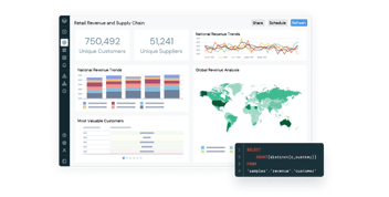
Power BI is Microsoft's analytical tool and one of the most popular, offering interactive data visualisations as well as easy integration with other corporate tools. In addition, Power BI can be integrated into third party applications using Power BI Embedded and enables highly secure reporting and data analysis. It can be connected to more than 60 data sources, such as Spark, Hadoop or SAP and is easy to use even for non-technical users.
Bismart is one of the few Microsoft's Power BI partner in Spain and we have been working with this powerful tool for years to provide our clients with the best adapted solutions.
Would you like to create better reports and dashboards in Power BI? Download our free e-book with the 21 best practices for creating reports in Power BI!
R Programming
This is one of the best analytics tools available in the industry today. It is mostly used for data modeling and statistics. This tool is very user-friendly and makes it possible and easy for you to manipulate and present your data in numerous ways. It beats many other tools in terms of performance, data capacity, and outcome. It works on multiple platforms including macOS, Windows, UNIX, etc. Depending on your requirement, it has over 11,000 packages and you sort these packages out by category and install them automatically.
SAS
This tool was first developed in 1966 at the SAS Institute, then further enhanced in the 80s and 90s, and is also a leading tool in data analytics to date. It is a programming language that allows you to manipulate data easily. It is very manageable, accessible, and has the ability to analyze a data irrespective of the data source. In 2011, SAS released a set of products, for their multiple SAS modules which include social media, web, college paper writing service, and marketing analytics, and for customer intelligence. It is now used widely for profiling both prospects and customers and to predict their behaviors and optimize communication with them.
Python
This is an open-source tool and a scripting language that is object-oriented and very easy to maintain, read and write. Python was developed in the late 80s by Guido van Rossum to support both structured and functional programming methods. Learning to use this tool is very easy and it has a lot of similarities to other languages such as Ruby, JavaScript, and PHP. It has libraries for machine learning and can be assembled on platforms such as JSON, MongoDB database, SQL server. It also handles text data well enough.
Excel
Excel is a very popular and basic analytical tool. It is quite a basic tool and is in use in almost all industries. It does not matter where your expertise lies, SAS, Tableau or R Programming, or you are even just into custom essay writing, you need to learn to use Excel too. This tool plays a big role when you have the analytics requirement on the internal data of a client. While it is a basic tool, it also has an advance business analytics option for modeling capabilities with prebuilt options such as time grouping, creating DAX measure, and automatic relationship.
Tableau Public
This is a free software connecting different data sources, Microsoft Excel, Data Warehouse, web-based data, etc. and creates dashboards, maps, and data visualizations that have real-time updates from the web. You can also share them with a client or through social media. Once you have access, you can download different formats for a file. To typically enjoy this tool and see its power, your data source must be very good. The Big Data capability of this tool makes it important and the fact that you are able to analyze and visualize data much better than other software for data visualization gives them an edge.
Rapid miner
This is a powerful tool for integrated data science. It was developed by a company that also performs predictive analysis and some more advanced analytics such as machine learning, text analytics, visual analytics, and data mining, without the need for programming. This tool can be incorporated with any type of data source including Excel, Oracle, IBM SPSS, Tera data, Access, Microsoft SQL, Dbase, Sybase, etc. This tool is able to generate analytics while taking its basis from the transformation settings of real-life data, meaning that you can control the data sets and formats for predictive analytics.
Apache spark
Apache was developed in 2009 at the Berkeley’s AMP lab at the University of California. This tool is a data processing engine that works large scale and can execute applications that are already in Hadoop clusters faster (up to10 times) on disk and as much as 100 times faster if it is in memory. The concept of this tool makes data science (which it is built on) very easy. It is a very popular tool for the development of machine learning models and data pipelines. It also has a library called the MLib, from where you can get techniques for repetitive data science such as collaboration filtering, regression, classification, etc. from an advanced set of machine algorithms.
QlikView
This tool has a number of unique features, some of which are in-memory data processing, and patented technology to help you execute your result quickly and store all the data that are present in the report. This tool automatically maintains data association and it can compress it to just 10% of the initial size. You visualize data relationship with colors, with one color given to related data, and another one to data that are non-related.
Want to learn more about the first tool on this list? Download now our e-book that includes the 21 best practices for reporting in Power BI!
Conclusion
Data analytics is made very easy with each of these tools and any of them at your disposal will serve you just right. They all function differently, with different capabilities and offer you different features. But what you know what you want in your data analytics tool, you can choose the one you need.
Exclusively written for bismart.com. Prepared by Becky Holton | Becky Holton is a journalist and blogger. She is interested in education technologies as well as in helping to write papers and articles, theses, and all kinds of academic texts.