This article explains what a dashboard is in data analytics and business intelligence. We also provide dashboard examples and what they are used for.
Nowadays, almost all companies use dashboards to visually represent and track the performance of their business activity. Dashboards are a major tool in data analytics and business intelligence.
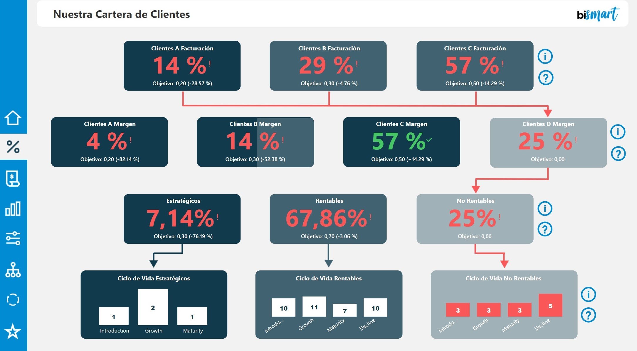
Bismart's ABC Client Analysis Dashboard
In business, managers and executives require tools to assist them in the decision-making process. Increasingly, data about their own activity, competitors and market trends play a crucial role in the decision-making process. Data-driven decisions can be very challenging without data analytics and BI technologies such as dashboards.
But what is exactly a dashboard in data analytics and business intelligence?This article provides a detailed explanation of what a dashboard is in data analytics and business intelligence and what is it used for.
- Don't miss the best Power BI dashboards of 2023! Download our e-book to explore them in depth.
What is a dashboard in data analytics and business intelligence?
A dashboard is a technological tool used by organisations to visually represent their business metrics and indicators. Dashboards provide a holistic and easily understandable picture of an area of the business activity and help managers to reach conclusions and make decisions.
Dashboards work like an Excel file and collect sets of data that they display in a single view. The structure, presentation and graphics of a dashboard will vary according to the needs of each company and a dashboard can include tables, charts, figures, KPIs, performance indicators, text, visuals, etc.
Dashboards are designed to make it easier for decision-makers to understand a certain business area, as well as to monitor activity and keep track of the evolution of the business.
A dashboard can be used to analyse and study any business unit or part of the business activity. Thus, organisations often have multiple dashboards: a dashboard for each department, a dashboard for a specific customer segment, a dashboard to analyse a specific project, etc.
In this regard, it is important to know the difference between a dashboard and a balanced scorecard.
What is a balanced scorecard?
As we already covered in the article 'Differences Between a Balanced Scorecard and a Dashboard', balanced scorecards and dashboards are not the same.
A balanced scorecard is a dashboard that provides a 360° view of the business activity and its performance. This type of dashboard must include the most important performance indicators or KPIs of each business area or department and should provide a complete narrative on the business objectives and how close the organisation is to achieving them.
If you are interested in what a balanced scorecard is, how to create them according to Kaplan and Norton's standards, what business objectives and performance indicators should look like and how to calculate KPIs, you can download our 'Guide to Evaluate Your Company's Performance and Strategic Plan' where you will find all the information you need.
What performance indicators should a dashboard include?
A dashboard can include as many indicators as we want. However, it is essential to keep in mind what we want to assess and to choose the appropriate indicators accordingly. For example, if we want to analyse the performance of our sales department, we will pick indicators such as the number of new clients, the number of negotiations with clients, the amount of closed deals, etc.
If we want to analyse the progress of a project or initiative we are carrying out, we will look at metrics such as the number of hours worked, our productivity, the results achieved, working hours' profitability, etc.
Who uses a dashboard in a company?
Dashboards are mainly used by decision-makers to analyse the productivity of a specific business area. Thus, a dashboard can be used by the CEO of a company, as well as by directors, department managers, project managers, etc. However, there are cases in which other workers use dashboards if they need to monitor their own work or analyse the performance of a specific project.
For example, in marketing, it is common for all employees in the department to use dashboards to evaluate the performance of their initiatives, monitor campaigns and so on.
What different types of dashboards are there?
There are different types of dashboards and their layout will vary according to the subject or part of the business we want to analyse.
The balanced scorecard is one of the most common dashboards and is used to keep track of all business activity, strategic objectives, actions, performance indicators and KPIs, etc.
Departmental dashboards are also very common and are used to monitor the performance of each department and to analyse the results and their evolution over time.
It is also important to distinguish between operational dashboards, analytical dashboards and executive dashboards.
What is an analytical dashboard?
An analytical dashboard is a data visualization tool that presents a comprehensive view of data, allowing users to perform in-depth analysis and exploration. It is typically used by data analysts, data scientists, and business analysts to uncover trends, patterns, and relationships within the data. Analytical dashboards provide interactive charts, graphs, and filters, enabling users to drill down into the data to gain deeper insights.
Key features of an analytical dashboard:
- Interactive data exploration: Users can manipulate data, apply filters, and perform ad-hoc analysis to answer specific questions.
- Data visualization: Various chart types (e.g., bar charts, line graphs, scatter plots) are used to represent complex data relationships.
- Business intelligence: Helps identify trends, outliers, and correlations to make data-driven decisions.
What is an operational dashboard?
An operational dashboard is designed to monitor and track real-time operational metrics and key performance indicators (KPIs) related to the day-to-day activities of an organization. It is used by operational teams and frontline staff to understand the current state of operations and quickly identify issues that require immediate attention. Operational dashboards provide a snapshot of critical metrics to support ongoing activities and optimize operational efficiency.
Key features of an operational dashboard:
- Real-time data: Provides up-to-date data and metrics for immediate insights into operational performance.
- Performance tracking: Monitors KPIs related to operational efficiency, productivity, and service levels.
- Alerts and notifications: Triggers alerts or notifications when predefined thresholds are exceeded, enabling proactive action.
What is an executive dashboard?
An executive dashboard is a high-level, summary view of key metrics and performance indicators that are relevant to top-level executives and decision-makers. It provides a quick overview of the organization's health and progress toward strategic goals. Executive dashboards focus on critical metrics and trends to facilitate strategic decision-making and long-term planning.
Key features of an executive dashboard:
- Key strategic metrics: Focuses on high-level KPIs that align with organizational goals and objectives.
- Top-level summaries: Presents summarized data and high-level visualizations for quick understanding.
- Drill-down capabilities: Allows executives to access more detailed data if needed to gain insights.
In summary, analytical dashboards are used for in-depth analysis and exploration of data, operational dashboards provide real-time monitoring of operational metrics, and executive dashboards offer a high-level view of key performance indicators to support strategic decision-making. Each type of dashboard serves a specific purpose and is tailored to the needs of different user groups within an organization.
However, the number and use of scorecards should be adjusted to each company's needs and business logic. Therefore, there are no set standards when it comes to dashboards and each business can use the number and type of dashboards that best suits its needs.
Advantadges of using BI dashboards
Using dashboards has many advantages for organisations. Obviously, the balanced scorecard is an essential tool for monitoring the company's performance, evolution and progress over time, as well as facilitating the decision-making process and weighing up business strategies and actions. Other benefits are:
- Having a global vision of the business situation. The balanced scorecard provides a comprehensive view of the business activity and its evolution over time, allowing decision makers to identify insights, decide which business strategies are working and which are not, and to understand why.
- New strategies and the generation of business opportunities. The ultimate purpose of a dashboard is to transform data and metrics into easy-to-understand information and to promote data-driven decisions. Dashboards enable new business strategies to emerge and existing ones to be improved.
- Risk reduction. The information on a dashboard needs to be constantly updated, nearly in real time, so that those responsible for analysing a business area can identify potential challenges or obstacles in real time and address them as soon as possible to avoid potential risks.
- Improvement of internal communication. Within a company, it is common for department managers and executives to have recurring meetings to analyse the performance of each business area. Having an analysis tool as powerful as dashboards improves internal communication between the different departments and facilitates the exchange of information within the organisation.
- Improvement of external communication. On the other hand, it is also common to use dashboards in meetings with external collaborators, partners or even clients to present the most important indicators of the company or metrics that strengthen the explanation of the most important issues to be discussed in the meeting.
Examples of business dashboards
As mentioned above, there are many varieties of dashboards. Below are some examples of the dashboards developed by Bismart.
At Bismart, as a preferred Microsoft Power BI partner, we develop our dashboards with this powerful analytical tool and produce comprehensive dashboards that provide the following elements of value:
- Integral solution: Our expertise in dashboards allows us to offer global solutions that include the development and implementation of the dashboard, as well as its conceptualisation, maintenance and support for its optimal use
- Top-down approach: Bismart develops dashboards using a top-down approach. In other words, first the analysis and monitoring of the most relevant aspects is covered, followed by more specific analysis and the identification of improvement areas.
- Predictive analysis: Our dashboards incorporate AI's predictive capabilities and we use predictive analytics to anticipate performance trends, identify market trends, detect risks and prevent potential problems.
- Attractive design and storytelling: We create our dashboards with the most appropriate design criteria according to the needs of each organisation, we take care of the user interface providing optimal usability, we adapt the look and feel to the corporate image of each company and we develop complete narratives applying storytelling.
- Data in business logic: Our dashboards respond to the business logic of each organisation. Our data models are business-oriented rather than technical.
- Uncovering hidden data: We have the ability to take advantage of data that is apparently useless, hidden or difficult to process due to its format or source. Through our data integration and ETL solutions we are able to integrate the necessary data into our dashboards.
- Alarm system: Bismart complements all dashboards with an alarm system that alerts users in case of detrimental results or remarkable events.
Dashboard examples: Our dashboards
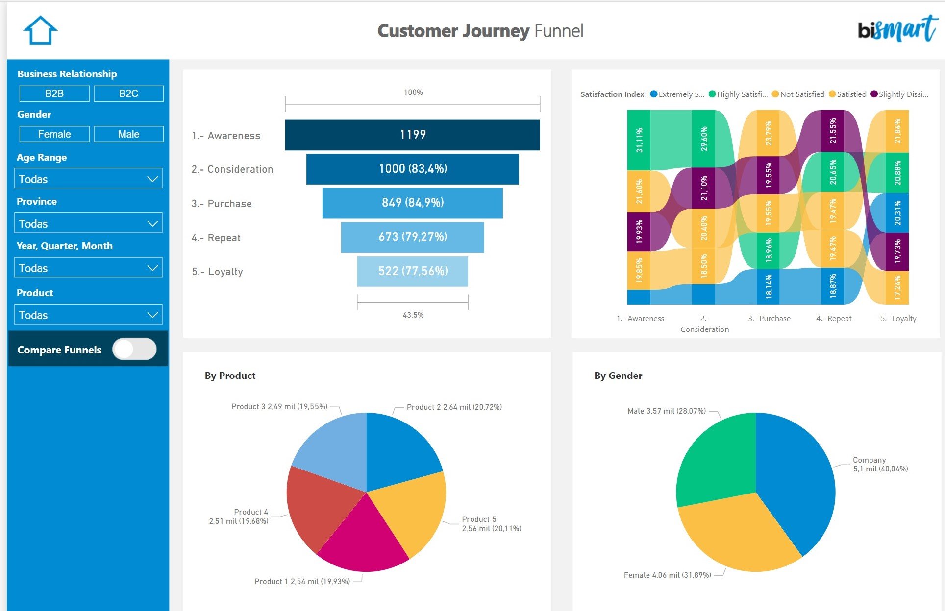
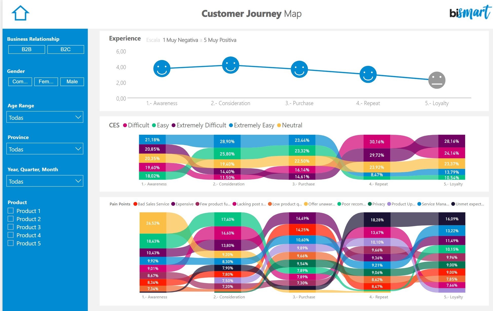
Bismart's Customer Journey Dashboard
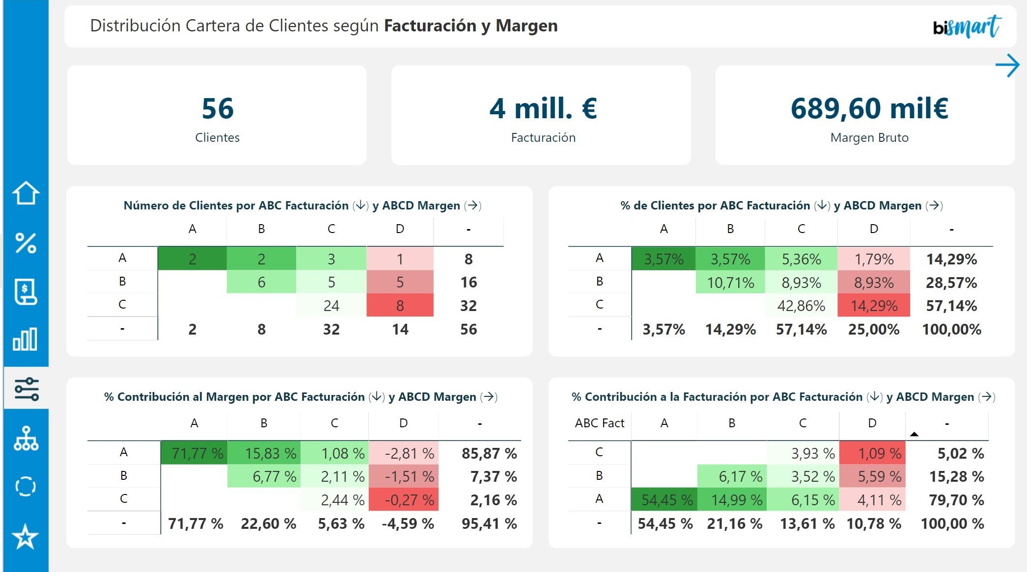
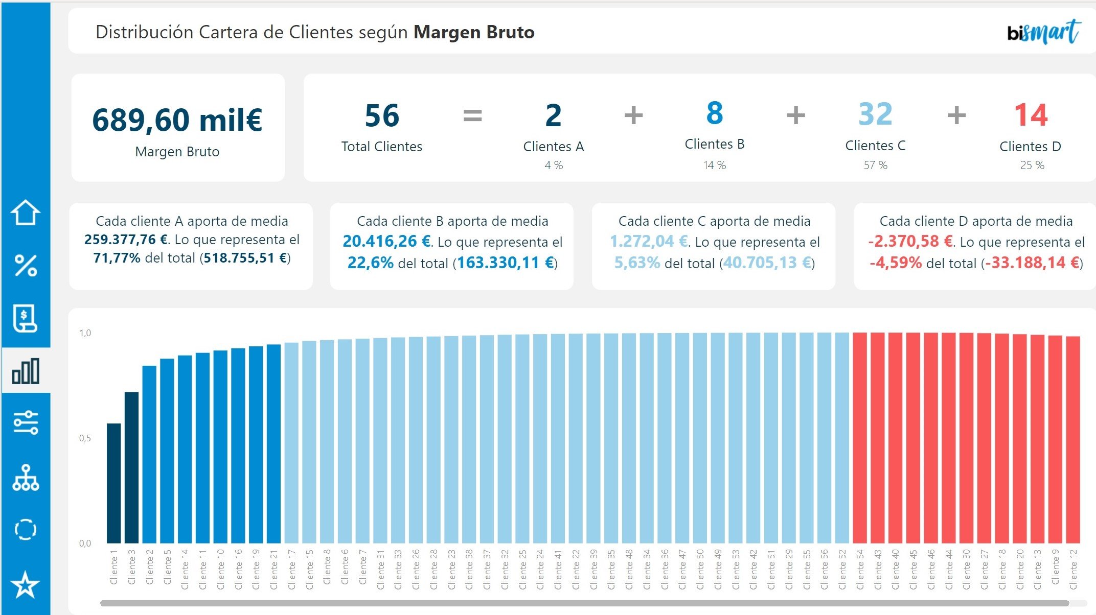
Bismart's ABC Client Analysis Dashboard
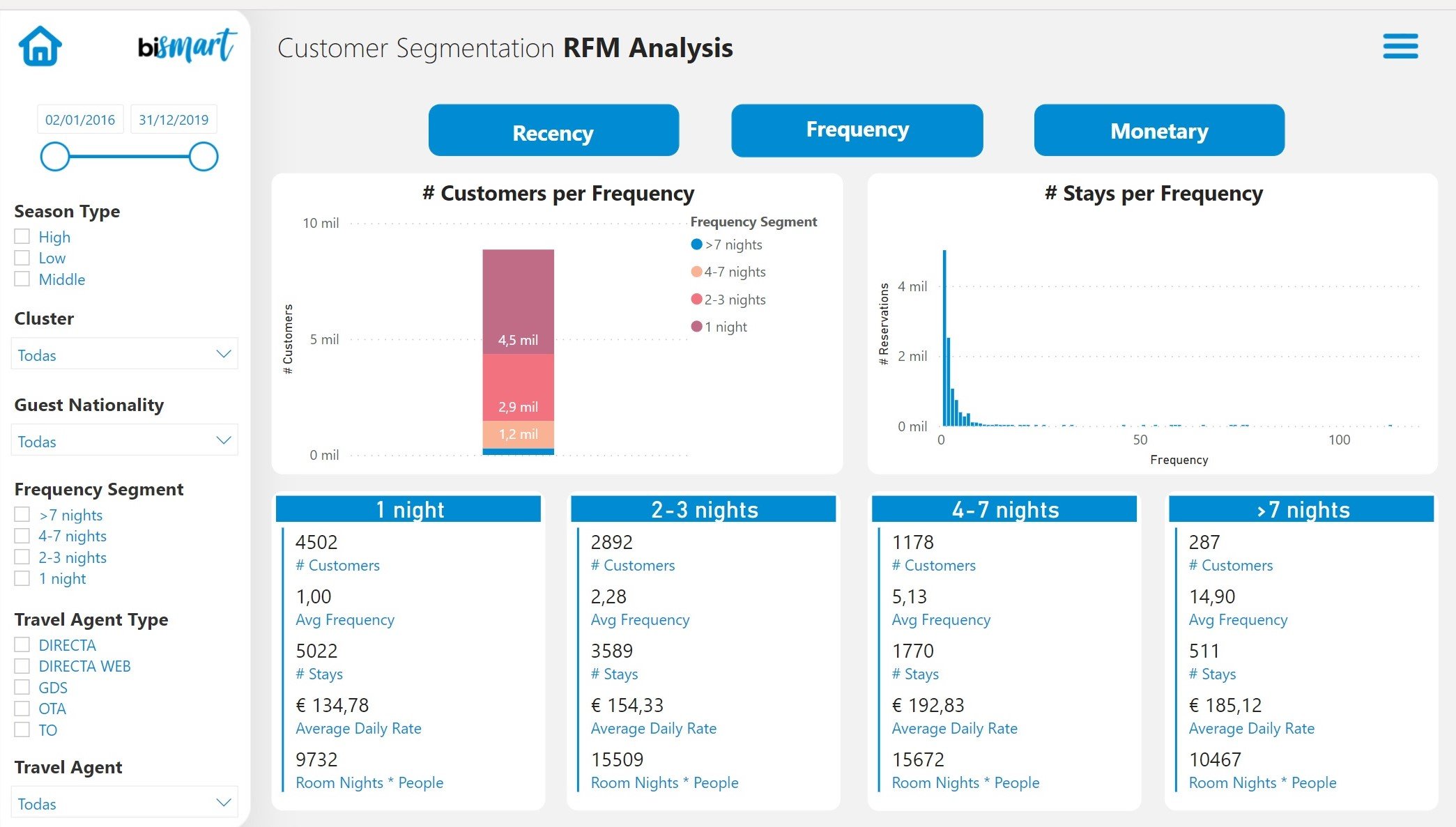
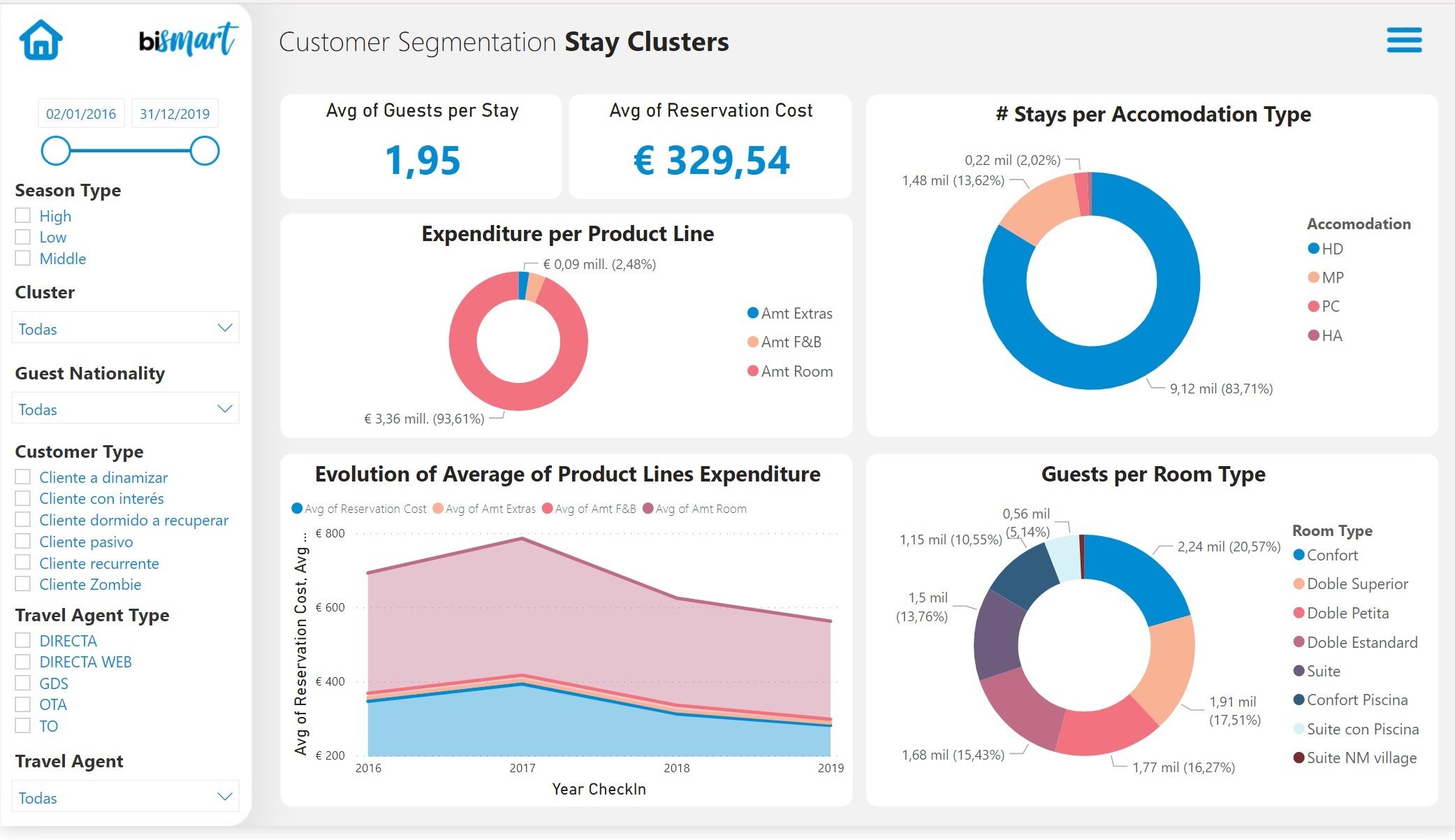
Bismart's Customer Segmentation Dashboard
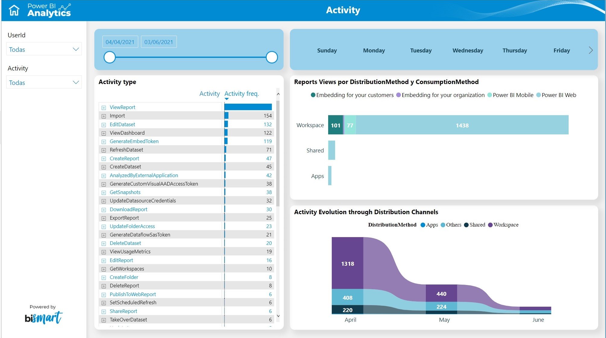
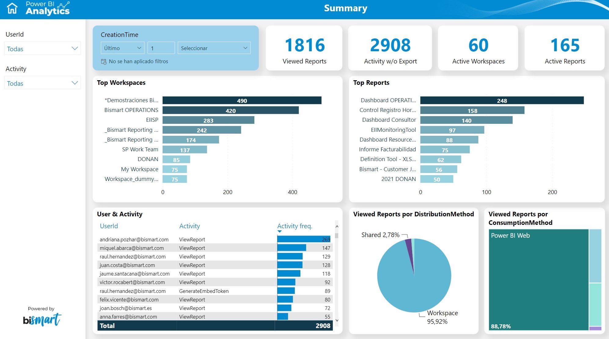
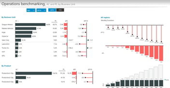
Bismart's Power BI Analytics Dashboard
Find out more...
In short, dashboards have become an indispensable tool for businesses. However, using the wrong dashboard or implementing ineffective technologies can lead to adverse results.
In this blog post we have listed some of the most used and well-known dashboards for business intelligence. However, you cannot miss our complete list with the 15 top Power BI dashboards of 2023!