We explain what an executive scorecard is, what information it should contain and how we can create one following 6 easy steps.
Dashboards are an essential tool for making decisions and monitoring specific business operations. However, for a dashboard to do its job, it is necessary to adapt its content and design to the target audience. We explore what a dashboard for executives should look like.

For a dashboard to be useful and fulfil its purpose —helping entrepreneurs understand the reality and state of their business— it is essential that it is not only well constructed at a technical level, but also that the design and layout of the information must be adapted to the purpose for which the dashboard has been created, the objective we want to achieve and the target audience.
The ultimate purpose of a dashboard is to transform data into easily understandable information, practically constituting a story that can be read, interpreted and analysed on a single page. In this sense, the implementation of a dashboard is a more complex task than it may seem and, on occasions, it may entail challenges and difficulties if we have not clearly defined the objective of the dashboard and to whom it is addressed prior to its creation.
In this blog we have previously explored the differences between a balanced scorecard and an ordinary dashboard. However, beyond the BSC, there are other ways to classify dashboards. One of the most effective is to classify them according to their function and the needs of its target audience. From this perspective, there are four types of dashboards:
- Executive Dashboard
- Analytical Dashboard
- Operational Dashboard
- Educational Dashboard
On this occasion we explore the executive dashboard: what is it, what is it for and what should it look like?
What is an executive dashboard?
As the name suggests, an executive dashboard is a type of dashboard that is aimed at the top management of a company, usually senior executives, and which purpose is to help managers make decisions based on data (data-driven decisions).
Therefore, an executive dashboard contains highly relevant information about the state of the company and should have the ability to present a picture of the business reality on a single page so that executives can reach conclusions and decisions quickly but comprehensively.
Thus, unlike other more specific dashboards, this type of dashboard must include storytelling. Therefore, we must arrange the information in the clearest way possible so that our audience does not have to make a great effort to understand it.
A dashboard aimed at executives must be highly interpretable and elicit conclusions rather than exploration.
Of course, any dashboard should include the ability to drill-down and explore information in greater depth, including direct entries to data sources so that they can be consulted if necessary. However, while drill-down will be more common in other types of dashboards, an executive dashboard should encourage the opposite. That is, presenting data in a way that makes it quickly interpretable without having to dig deeper. However, if exploration is required, the usability of the dashboard should be optimal so that non-technical users can easily, quickly and intuitively drill down into the data.
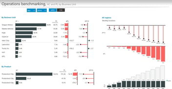
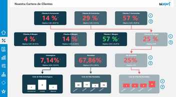
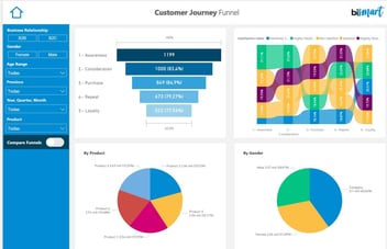
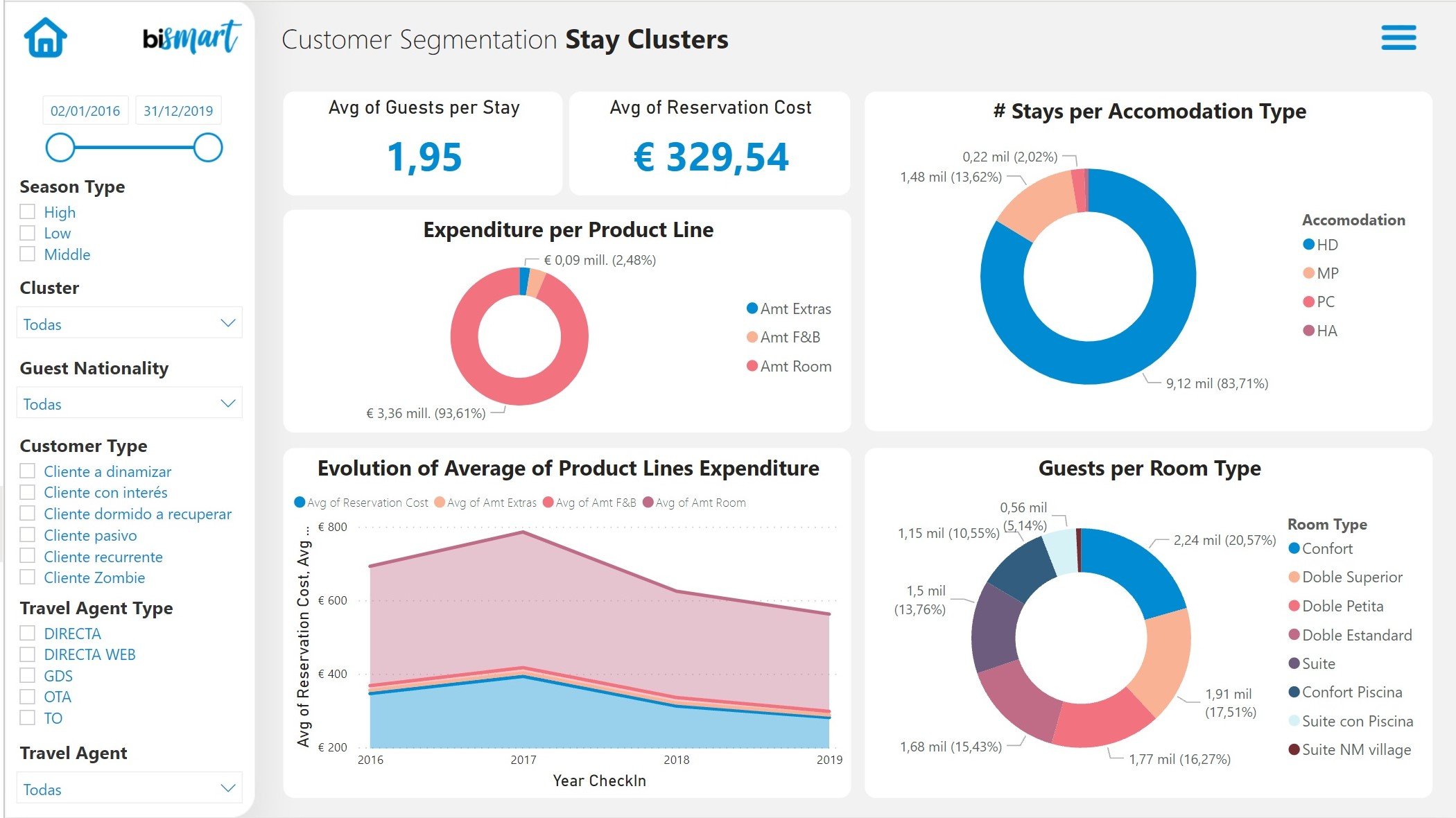
On the other hand, it is also very important for the dashboard to incorporate an appropriate storytelling that does not lead to different interpretations and, above all, to confusion or misinterpretation. In this regard, data visualization and the choice of visuals for our dashboard will be decisive. The visuals of an executive dashboard should be extremely straightforward, clearly labelled and self-explanatory. A chart or tabular visual with multiple dimensions, a large number of variables and data will be of little use.
Ultimately, if this type of dashboard is displayed to a room of 8 executives, they should all come to the same conclusions and read the same story. If that is not the case, the dashboard is not doing its job.
How to create an executive dashboard?
The first step to start building a dashboard is to choose the design tool. At Bismart we are committed to Power BI, a set of business intelligence platforms with infinite possibilities for creating dashboards and reports.
1. Establish the dashboard's main objective and other specific objectives
When creating an executive dashboard it is extremely important to spend time deciding what we want to show, what the main objective of the dashboard is —in relation to the business objectives— and how we are going to organise the data so that the message reaches our interlocutors.
This preliminary step is more important in this type of scorecard than in any other. It is not only relevant to choose what information to show, but also what information to highlight, how we are going to organise it and justify the reasons why we are showing that information.
2. Choose the right metrics and Key Performance Indicators (KPIs)
In an executive dashboard, data and information are usually displayed in the form of performance indicators —which include metrics related to business performance— and KPI.
Therefore, choosing the data and information we want to include in our dashboard is as important as choosing the metrics and performance indicators. If we do not pick the right metrics and indicators and apply them correctly, the dashboard will be meaningless and will not serve its purpose.
3. Use the right visuals
Once we are sure what information we want to show and through which metrics and indicators, we can move on to establish how we will represent the information visually so that it reaches our audience faster.
In a dashboard aimed at executives, choosing clear, easily understandable, visually appealing, interactive and simple visuals is elementary.
At Bismart, as a preferred Microsoft Power BI partner, we have our own e-book with the best Power BI visuals. In addition, our solutions have high-performance visuals thanks to our partnership with Zebra BI.
4. Make sure this is the story you want to tell
Once our dashboard is beginning to take shape, it is advisable to stop for a moment to consider what we are doing and ask ourselves if what we have in front of us meets the objectives we had set at the beginning. Polishing the storytelling of a dashboard is key. Fortunately, tools like Power BI make it very easy to create stories from data.
If we believe that the message of our dashboard is not appropriate, is not understandable or the information is too extensive or complex for managers to analyse and make quick decisions based on it, it is better to step back and rethink the content and design of our dashboard.
5. Take care of usability and user experience.
Si nuestro cuadro de mando dispone de la información correcta, pero los usuarios no saben cómo llegar a ella o tardan mucho en hacerlo, el dashboard no será eficiente.
Usability and user experience (UX) are key in any dashboard. However, in this type of dashboard, these two aspects are even more critical.
Executives and senior managers are not usually technical profiles, so navigating screens, visuals and data will be more difficult for them than for a BI consultant or a data analyst, for example. In this sense, taking care of the usability and experience of our audience is absolutely necessary in this case.
The creation tool we chose will also have an impact on usability. Power BI is one of the best tools when it comes to promoting a great usability and UX.
If our dashboard has the right information, but users don't know how to find it or it takes them a long time to do so, the dashboard will not be efficient.
6. Review it with other employees with a non-technical profile
Finally, before handing over the dashboard or making it operational, it is advisable to validate it with other employees, especially those with non-technical profiles.
No one better than people who do not know the subject, the information and the purpose of our dashboard will be able to tell us if, indeed, it reflects the story we want to tell.
Conclusion
Being aware of the needs, capabilities and objectives of the target audience for a dashboard is essential to be able to adapt its content and design and ensure that the dashboard does its job effectively.
This time we have explored what an executive dashboard is and what to look for when creating one. Over the next few weeks, we will explore the analytical dashboard, the operational dashboard and the educational dashboard - don't miss out!
If you are interested in corporate dashboards, download our e-book with the 15 best Power BI dashboards of 2021!