Discover how to optimize your Power BI and Excel reports, dashboards, charts and tables with Zebra BI's amazing visuals.
Maximize the analytical power of your Power BI reports with Zebra BI! Developing powerful, more complete, innovative and inspiring data visualizations and dashboards has become a competitive advantage for businesses. Zebra BI is a service that can be integrated with Power BI and Excel and complements these tools with unique technical possibilities such as waterfall charts with subtotals, flexible tables, the creation of more dimensions in the same chart or advanced analysis with small multiples. We talk about the power of data visualization and explain how you can optimize your Power BI reports with Zebra BI, the application that takes reporting to another level!

In this article you will find...
- The Importance Of Data Visualization In Business
- Zebra BI: Los mejores visuals para Power BI y Excel
- Discover What You Can Do with Zebra BI: Access Our Report
Data visualization has become one of the key data-related activities and practices and is today a fundamental requirement for fostering a data-driven business culture and reaching data-driven decisions, i.e. informed business decisions based on data. It is the final element of the data collection, integration and analysis process and contributes to the democratization of information, turning data into understandable, useful and impactful information.
The Importance Of Data Visualization In Business
The relevance of data visualization has been growing at the same pace as the importance of data, more and more necessary at all levels of a company. Today, it is essential that all departments and employees, especially those involved in the decision-making process and the creation of business strategies, have access to consolidated, validated and previously analyzed information with a specific objective in mind. Therefore, it is increasingly essential that more and more people are able to understand the data related to business activity so that drawing conclusions becomes effective. In this sense, visualization is the tool that allows us to transform mathematical formulas (data) into clear and clear sentences (visualizations, reports, charts, etc.).
Furthermore, data visualization also plays a key role in building relationships with our customers. When making contact with customers, the sales department usually presents reports that endorse and demonstrate the reliability, efficiency, good performance of the company and the results promised by the product or service offered. Ensuring that the information presented to the customer is as clear, concise, understandable and persuasive as possible is essential to convince them. In fact, it is just as important as the treatment they receive, the offer presented and the final results of the product, service or project. After all, people are driven by emotions and perceptions, so the aesthetics of the information provided can lead a customer to choose your company over the competition.
In today's market there are a large number of platforms and tools for performing data visualizations. Obviously, not all tools have the same capabilities or achieve the same results, which is why it is so important to choose the right platform that suits the needs of the company and the capabilities of those in charge of creating reports, dashboards and visuals. The quality of our visualizations is closely linked to the capabilities of the tool we use to develop them.
Zebra BI: The Best Visuals For Power BI and Excel
Zebra BI is especially designed to meet businesses' data visualization, reporting and data analysis needs. It acts as a provider of easy-to-understand, attractive and powerful visuals for Power BI and Excel and complements the capabilities of both tools with advanced reporting techniques that Power BI does not allow. Zebra BI visuals are benchmarked, and even Microsoft uses them for internal reporting.
At Bismart, as a Microsoft Power BI partner, we have been developing our technology and business solutions through Power BI for years and we always try to be up to date and show you the best ways to get the most out of it and explore new ways to use this tool. In fact, in a previous post in this blog we explained how to create the Google Analytics time filter in Power BI.
Recently, Bismart initiated a partnership with Zebra BI, including Zebra BI visuals in our reports, which allows us to create more advanced visualizations and greatly improve the design of our solutions.
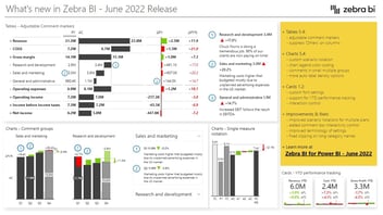
Check it out by accessing our Zebra BI report below!
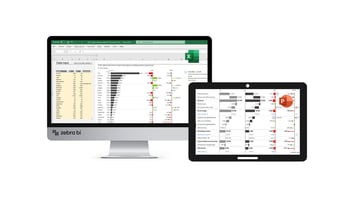
Zebra BI is a self-service BI platform that offers numerous advantages over other data visualization tools. Integrable with Excel and Power BI, it enhances the data analysis and visualization capabilities of these tools by enabling extra features such as charts with more dimensions, segmented tables with customized table segments (MTD, YTD, YTG and Full Year), simplified data modeling, column highlighting in tables and charts, pricing calculations, etc.
Because of this, Zebra BI is the ideal platform for finance, marketing and sales, as it facilitates the creation of easy-to-use and comprehensive revenue, profit and loss reports in Power BI. In addition, it supports and contributes to achieving valuable business insights by enabling analysts to gather more detailed information and explore every detail of the business situation and activity in depth. As Zebra BI's website announces: "With Zebra BI visuals you don’t just show how something is good or bad, but you can tell exactly what’s going on."
Some of the advanced functionalities of Zebra BI are:
- More complete, attractive and understandable business visuals, reports and charts: Zebra BI enables the development of more advanced charts and reports thanks to unique features such as waterfall charts with subtotals, the inclusion of forecasts in monthly reports or advanced analysis with small multiples.
- Easy to use: One of the strengths of the matrix is that it enables the development of extremely powerful visuals in the simplest way. Zebra BI is easy to use, intuitive and facilitates the creation process, reducing endless tasks to a single click.
- Create reports, dashboards and analyze your data way faster: Zebra BI visuals facilitate the calculation and visualization of insights and enable the implementation of better business strategies. Creating reports has never been so easy and fast!
- Create flexible tables in which you can embed graphics, reorder columns, hide and show columns, create column hierarchies, and expand and collapse rows in an unlimited way.
- Consistent design: Zebra BI encourages visual and corporate design harmony. Even if hundreds of people consult and modify the same reports or dashboards, the tool allows you to ensure that all pages, reports and dashboards have a coherent and consistent design.
- Dynamic highlighting of specific freely selectable columns for both charts and tables.
- Includes subtotals, cost inversion functions, N-type analysis and profit and loss calculations with subtotals.
- Simplifies data models with out-of-the-box YoY growth rates, PY, Forecast, etc.
- Endless possibilities for chart creation: automatic variation charts, matrix charts, waterfall charts, bar charts, lollipop charts, etc.
- One-click column sorting.
- Customizable design.
- Ordenación por columna en un solo clic.
- Responsive visuals with more than 4 base measures with variations in a single visual.
- Visuals certified by Microsoft and compatible with all Microsoft platforms and tools.
Zebra BI is, without a doubt, the most powerful visual matrix for Power BI and what you need to enrich your reports, graphs and dashboards and innovate in data visualization.
If you would like to see for yourself what you can do with Zebra BI, access our report and explore the possibilities: