The Visual Vocabulary is a tool that facilitates data visualization chart choices. Read our post to discover it.
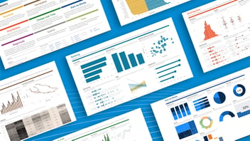
The Visual Vocabulary is a complete guide to which Power BI visuals to use. Depending on the data you want to display, you will need to use one or another.
If you have a dashboard created by Bismart you will see that the graphics, visuals and custom visuals we have put together do not respond to the consultant's personal preference, but to a worldwide consensus on which Power BI visuals are used in each case.
Bismart, as a preferred Power BI partner, recommends the use of this graphic symbolism to visualize concrete data and represent the information in a simpler way. This is known by different names: dataviz, data visualization, visual vocabulary, data stories, Power BI visuals, better chart choices...
What is a visual in Power BI?
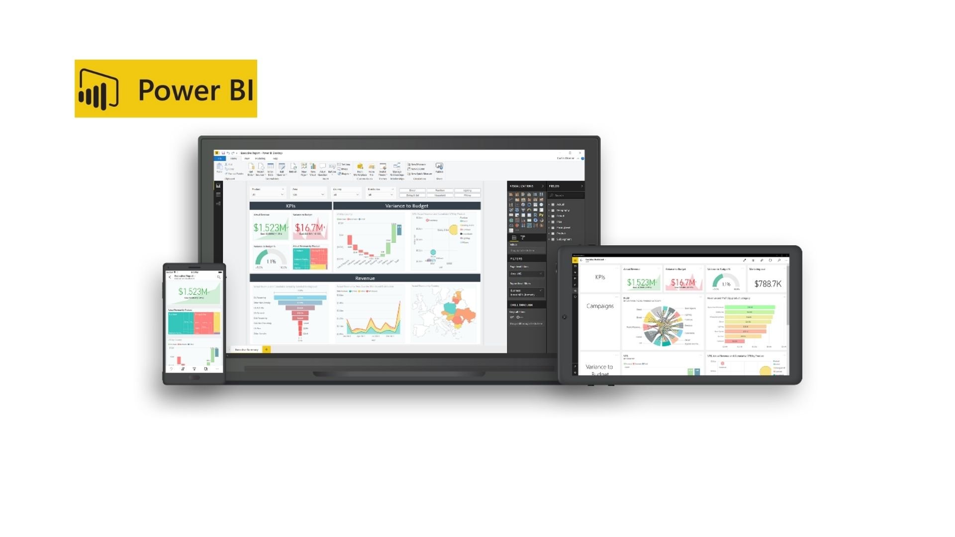
In Power BI, a visual refers to a graphical representation of data within a report or dashboard. Power BI is a business intelligence tool developed by Microsoft that allows users to connect to various data sources, transform and model the data, and then create interactive visualizations to gain insights and tell a data-driven story.
Visuals in Power BI can take various forms, such as charts (e.g., bar charts, line charts, pie charts), tables, maps, matrices, KPI indicators and more. Each visual is created based on specific data fields and is fully customizable, allowing users to change colors, labels, titles, and other visual properties to fit their reporting needs.
These interactive visuals make it easier for users to explore data, spot trends, compare values, and draw conclusions. By combining multiple visuals in a report or dashboard, users can present complex data in a more understandable and engaging way, enabling better data-driven decision-making within organizations.
What is visual vocabulary in business intelligence?
Basically, you should know that there is a visual vocabulary supported by the Financial Times Graphics Team and by Microsoft Power BI and Tableau to facilitate the choice of graphs to represent data. The Visual vocabulary does not seek to prescribe how graphs should be made, but to take advantage of opportunities to use them in conjunction with words.
A very effective way to ensure that our team applies the best Power BI visuals is through the creation of themes in Power BI so that all our reports and dashboards have the same structure.
Want to learn how to create themes in Power BI? Download our e-book: "How to create Themes in Power BI".
Download e-book
The creation of this visual vocabulary is due to the fact that, as the Financial Times explained, an important part of society is not able to understand simple graphics. This is a serious problem, because in the post-truth era it is crucial to know how to move between data and information in order to form critical opinions. Moreover, it is not possible to avoid them and explain the data they contain, because the information transmitted with certain graphics cannot always be replaced by verbal explanations.
Another problem related to the graphical representation of data is that the companies that make Power BI dashboards are experts in data processing, but they are not trained to share complex information to non-expert audiences.
That is why at Bismart we train our professional statisticians and why they always work together with expert consultants in the transmission of complex information.
The best Power BI visuals
One of the actions that comes out of this relationship is the use of this visual vocabulary that helps to encourage a better choice of graphics and, ultimately, bring data experts closer to people with basic statistical knowledge.
Inspired by the work of the Financial Times, SQLJason created the Power BI version of Visual Vocabulary. He added some more graphics that seemed relevant to him:
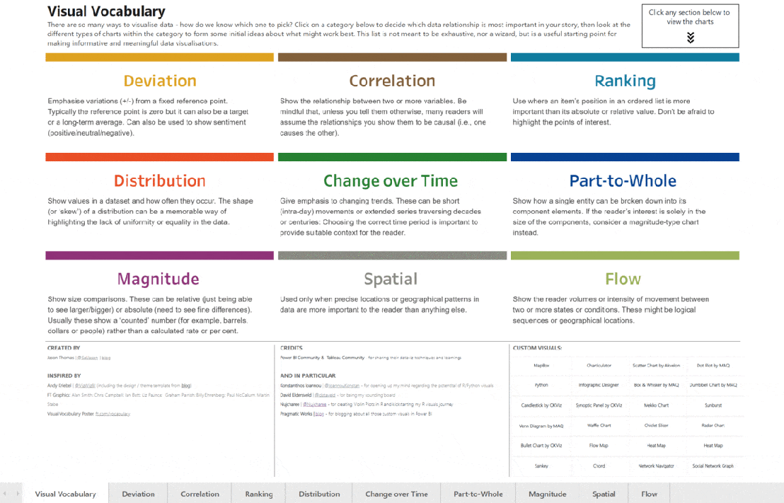
The Choice of Graphs
The choice of graphs depends on the category and type of data that will be shown. They are divided in the following categories:
Deviation
Emphasizes variations (+/-) from a fixed reference point. Normally, the benchmark is zero, but it can also be a long-term objective or average. It can also be used to show sentiment (positive/neutral/negative).
Correlation
Displays the relationship between two or more variables. Keep in mind that, unless told otherwise, many readers will assume that the relationships shown to them are causal (i.e., one cause the other).
Ranking
Used when the position of an element in an ordered list is more important than its absolute or relative value.
Distribution
Displays the values in a dataset and how often they occur.
Change over time
It emphasizes changing trends, which can be short movements (days) or extended series spanning decades or centuries. The choice of the correct time period is important to provide a suitable context for the reader.
Part-to-whole
They show how a single entity can be broken down into its constituent elements.
Magnitude
They show size comparisons. These can be relative or absolute. They usually show a "counted" number (e.g., barrels, dollars, or people) rather than a calculated rate or percent.
Spatial
It is used only when precise locations or geographic patterns of the data are more important to the reader than anything else.
Flow
Shows the reader the volumes or intensity of movement between two or more states or conditions. These can be logical sequences or geographic locations.
Power BI visuals with Zebra BI
Zebra BI is a powerful data visualization and reporting tool that specializes in creating Power BI visuals with a focus on financial data. It is a software solution designed to enhance the way financial and business professionals present complex data, especially in the context of financial reporting, budgeting, and analysis.
Zebra BI is known for its ability to create clear and easy-to-understand charts, tables, and Power BI visualizations that enable users to interpret financial data more effectively. The tool is particularly popular among finance and accounting professionals, as it can simplify the presentation of financial statements, key performance indicators (KPIs), and other financial data, making it more accessible to a wider audience.
Before you go...
Don't forget to download the Financial Times Graphics Team PDF explaining Visual vocabulary in depth and how to use it: