Do you have to create a visual with multiple categories? Discover 10 alternatives to using lots of colours so that your visuals don't look like a rainbow!
Visualisation is one of the most important aspects of reporting. Visuals play a major role in the democratisation of data, by helping executives to understand the data so they can make better decisions. However, using too many colours can work against us, causing confusion and making our reports look childish. Here you will find 10 alternatives to the use of colours that will help you create better visuals.
What is data visualization?
Data visualisation is an essential part of business intelligence, being one of the most important elements for business users to understand the data and be able to draw conclusions. Reporting and data visualisation are crucial elements of data analysis and the decision making process.
- Want to take your data visualisation to the next level? Don't miss our exclusive guide to 10 tips for using fewer colours in a visual! Put them into practice and let us know the results.
Guide: The Importance of Color in Visuals
Learn how to apply storytelling
without using too many colors.
What is the role of color in visual language?
Colour is of great importance in visual language and plays a major role in the visualisation of data. Among many other things, colour is used to:
1. Category Differentiation:
- Categorical Palettes: Colors are used to distinguish different categories or classes in qualitative data. Example: A bar chart that shows sales by region, using a different color for each region.
- Visual Discrimination: It is essential to select colors that are easily distinguishable from each other to improve clarity.
2. Magnitude Representation:
- Continuous Scales: For quantitative data, color gradients can represent a continuous variation. Example: A heat map that shows population density with a gradient ranging from light to dark colors.
- Choropleth Maps: In maps, colors indicate the variation of a numerical value within defined geographic areas.
3. Emphasis and Hierarchy:
- Contrast: Bright or saturated colors are used to highlight important points, such as outliers in a graph.
- Desaturation: Neutral or desaturated colors are used to give less prominence to secondary elements.
4. Context and Relationship:
- Diverging Palettes: Used to represent data with a neutral central value, like zero, and show positive and negative deviations. Example: A chart that shows the difference between profits and losses.
- Sequential Palettes: Indicate an ordered progression of values, like the range of temperatures on a map.
5. Consistency and Familiarity:
- Standard Color Maps: Colors representing familiar phenomena should be consistent with expectations. Example: Using blue for water and green for vegetation in geographic maps.
- International Conventions: Like the use of red for danger or negative values, and green for safety or positive values.
6. Accessibility:
- Color Blind Compatibility: Ensure that color combinations are distinguishable for color-blind individuals. Palettes like Color Universal Design (CUD) or Color Universal Design Organization (CUDO) are helpful.
- Adequate Contrast: Ensure sufficient contrast between background and foreground colors to guarantee legibility.
7. Cognitive Optimization:
- Pre-attentive Strategy: Colors can be used so that viewers identify patterns and differences before consciously processing the information.
- Visual Grouping: Similar colors visually group related elements, facilitating comparison and analysis.
How does color work?
Color in data visualization works as a key tool to enhance understanding, analysis, and interpretation of information. When used strategically, it facilitates comprehension, highlights patterns, and improves accuracy in interpreting data. Selecting the right colors ensures that the visualization is accessible, attractive, and functional for a diverse audience.
Why should you not use too many colors in a visual?
Colour plays a major role in graphic representation and, among other things, is used to differentiate between elements. However, developers often face a dichotomy: having to represent many categories in the same chart, which can result in visuals that look like a rainbow.
Less is more. The excessive use of colours in the same visual can generate the opposite effect to the one desired, generating confusion and making the information unintelligible.
At this point you might be wondering: "So, if I have to represent a lot of variables, how do I do it?
At Bismart, a Microsoft Power BI partner, we are experts in data visualisation with Power BI. Our data analysts and BI consultants have created a list of best practices regarding the use of colour in visuals.
Here are 10 alternatives to using too many colours in a visual. Apply them, observe and tell us the results!
Download the guide with the 10 key tips to always have them at hand and optimise your data visualisation!
Guide: The Importance of Color in Visuals
Learn how to apply storytelling
without using too many colors.
10 ways to use less colours in a visual
1. Try using the same colour throughout the visual
If you find yourself in front of a screen with a visual that is too colourful, try applying the same colour throughout the visual. It may seem silly, but sometimes it is necessary to ask ourselves: What are colours for? What is their function? Normally, to separate categories. However, most charts are already designed to reflect different items and colours are simply unnecessary.
For example, in a simple bar chart, bars already separate different elements. So, why do we need different colours? Well, we don't.
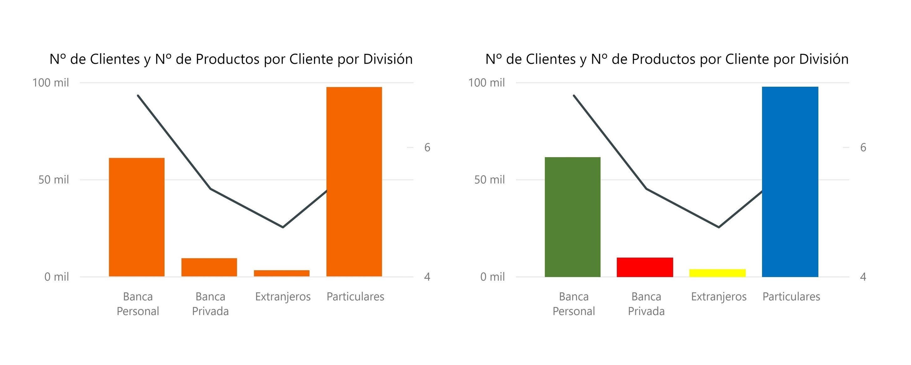
Source: Bismart
Try it. Create a bar chart in which each bar is a different colour. Then design the same chart in one colour and ask a colleague: which one is easier to understand?
2. Use different shades instead of different colours
A good way to differentiate elements through colour is by applying lighter and darker versions of the same colour rather than different colours. This will prevent our graphic from looking amateurish while making it easier for end-users to distinguish between categories.
On the other hand, shades can also be used to give more importance to certain items. The human eye is designed to perceive the strongest colours first and, therefore, tones can be used to highlight objects over others.
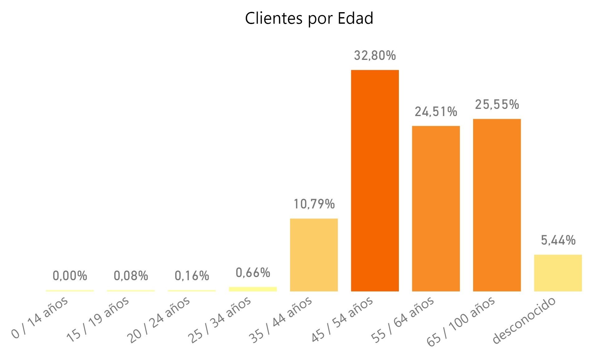
Source: Bismart
Again, we encourage you to try it. Continuing with the example of a bar chart, first colour some bars in stronger colours and then do the same on different bars. Again, bother your colleague and ask them which elements of the graph they think are the most important.
3. Replace colour with other visual elements
There is a world beyond colour. Most reporting tools and platforms provide graphical elements that allow you to visually differentiate between variables without having to use different colours. For example, in a scatter chart, instead of distinguishing points with colours, we can use different symbols in the same colour. In a bar chart, we can play with texture, patterns or opacity.
However, we also have to be careful here. As it happens with colours, if we make an excessive use of these graphical elements, they can lead to confusion.
4. Highlight one or a few categories
Communication is a fundamental part of data visualisation. If you want to express ideas about the data through a visual, it is essential that, before designing it, you decide what you want to emphasise.
Take a few seconds and ask yourself: What statement do I want to make through this visual? What element of the visual helps me make that statement?
Once you know it, visually highlight that element and leave all the others aside.
Look at the image below, which of the two charts better highlights an element?
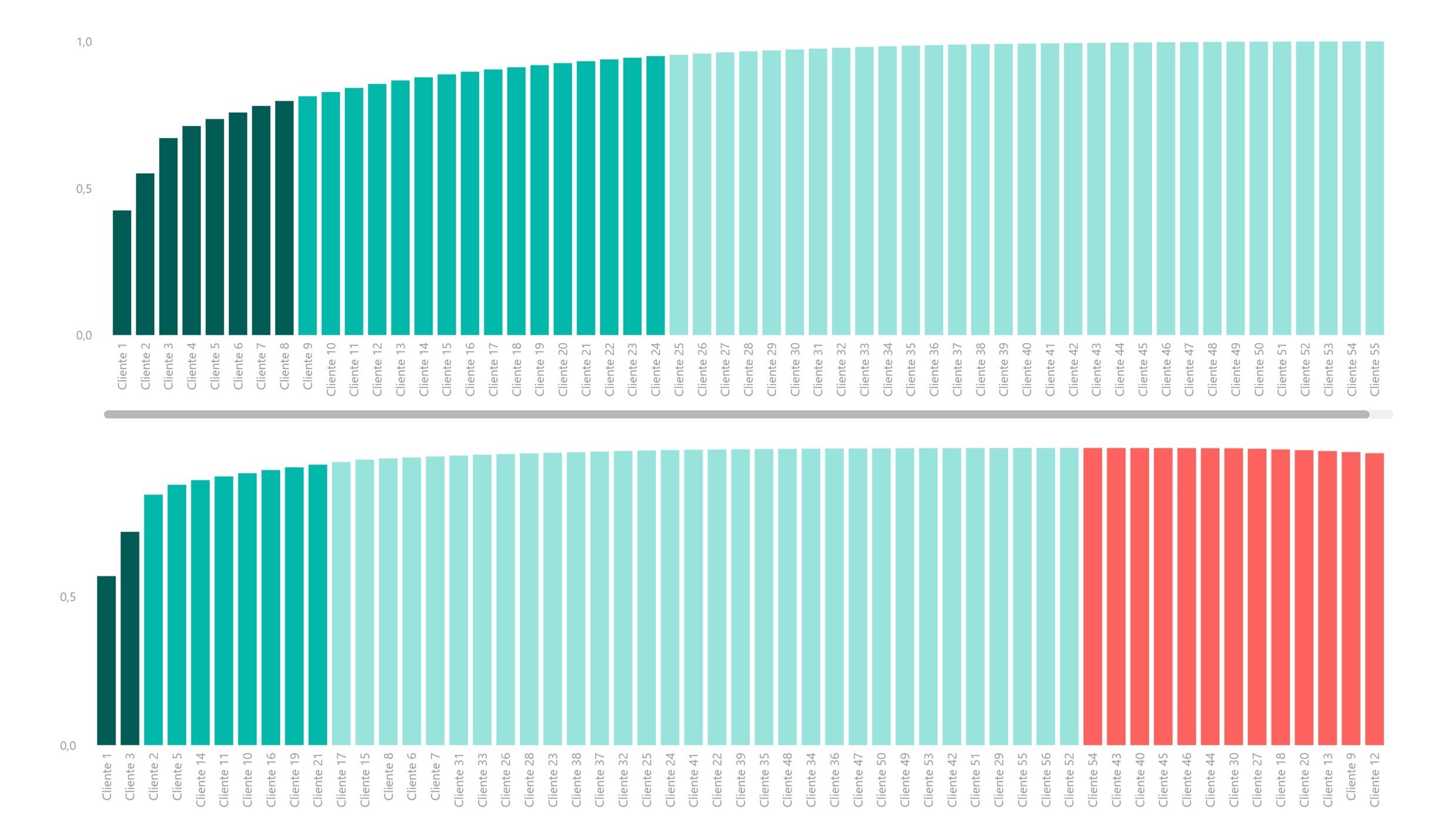 Source: Bismart
5. Merge several categories into one
As we have already seen, when we highlight categories through colour, we are classifying the elements of the visual into two groups: important and unimportant.
In a chart with many categories, it can be effective to merge the less relevant categories into one. This will simplify the visual and help end-users understand the information much better. If we want to go into more detail, we can always explore the "unimportant" categories in more depth.
For example, if we want to visually represent a large number of countries, instead of showing all of them, we can group them into continents. Obviously, if we do so, we should do so through a top-down approach so that whoever sees the dashboard or report has the possibility to explore the countries of each continent.
6. Show all the categories, but merge them through colour
Sometimes it is impossible to only show some categories, since the less significant are essential to express the message. In this case, we can show all the categories, but merge the less relevant ones by painting them in the same colour.
7. Use direct labels
Direct labels are a good alternative to the use of different colours, as they allow the recipients to distinguish between variables even if a visual has only one colour.
In addition, labels express information that colours are unable to. For example, let's imagine we have a bar chart in which each bar represents a geographical area. If we use different colours for each territory, end users will not be able to know the territory. However, if we apply the same colour to the whole visual, but label each territory, they will.
 Source: Bismart
8. Whenever you can't use direct tags, use tooltips
Tooltips are labels that appear in the visual when the user hovers the mouse over an element. Therefore, unlike direct tags, tooltips do not appear constantly on the screen and users can only view one at a time.
This hinders comparison, so direct tags are better when we want to compare between elements. Nevertheless, we cannot use a hundred direct labels in a visual. That is why we shoulds use tooltips for the less significant information.
9. Try changing the type of chart
Changing the chart type is the best option to use less colours when we cannot merge or hide categories.
When this happens, we should try to find a visual that clearly distinguishes all categories through position so that it is not necessary to do so through colour. For example, a split bar chart will always differentiate elements better than a stacked bar chart.
Choosing one visual or another can completely change the storytelling of our dashboard. Spending several minutes choosing the right visual is never a waste of time.
- Take a look at the best Power BI visuals
10. Small multiples
There is a very effective visual or visualisation technique to reduce the number of colours when all the other options are useless: "small multiples".
This technique consists of transforming a chart with many categories into a chart for each category. In other words, making small multiples of the same graphic by giving each category its own space instead of putting them all together in the same visual.
Small multiples make it easier to see trends in each category, but they make comparative analysis difficult. Therefore, if we want to compare, small multiples is not the best option.
If you want to transform a chart into small multiples, don't worry. You don't have to create a new chart for each category. Most business intelligence tools automate the process. For example, Power BI has the option "small multiples" since 2020.
Conclusion
Using different colours is the simplest way to differentiate elements within a visual. Although it is an effective technique, we have to use it in moderation and make sure that our visuals don't end up looking like a rainbow.
Next time you are creating a visual with many elements or variables, apply one of the 10 techniques mentioned in this post. End users will be grateful.
Don't forget to download the 10 tips for using fewer colours in a visual if you haven't already!
Guide: The Importance of Color in Visuals
Learn how to apply storytelling
without using too many colors.
