Do you want to know how to create powerful dashboards that promote the democratisation of data? Here are 12 tips to create an optimal dashboard.
As companies become increasingly aware of the value of data-driven decisions and the power of data, the relevance of data visualisation and the criteria for presenting information through dashboards is growing.
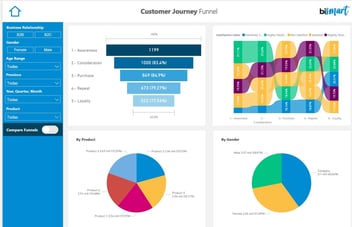
 Dashboard de Bismart Customer Journey
Companies use data to make better decisions, optimise their business strategies and get a full picture of where their business stands. Through data, companies discover valuable data and insights about their customers, suppliers, competitors and their own activity. When making strategic decisions it is essential that the way data is presented promotes the understanding of the data so that conclusions can be drawn. If decision-makers within an organisation are unable to understand the information on which they have to base their decisions, prior data collection and analysis are in vain.
In this regard, it is important to be clear about the difference between a balanced scorecard and a dashboard.
The creation of dashboards that facilitate the understanding and analysis of data sets is becoming increasingly valuable. When processing and managing data, technical knowledge is fundamental to create valid charts —or visuals— and communicate the information contained in the data to people with expertise in other fields.
In this blog we have previously talked about the best Power BI visuals to share specific information. This time, we focus on usability tips to create optimal dashboards and present the information in the best possible way.
1. Common metrics and customized metrics
An effective business dashboard should include the most common and usual metrics —those that are essential for any type of business, regardless of the sector of activity or business model—, but also customised metrics that are significant for our business in particular. These metrics are the ones that allow us to evaluate specifically relevant facts about our company's performance.
2. Promote data comprehension through visuals and charts
When designing dashboards, especially those aimed at non-technical profiles or people who are not used to working with data, it is crucial to show the information in the most understandable way possible. This implies the incorporation of charts, graphics and visuals that represent the data so that anyone can understand it.
Power BI enables the creation of attractive, dynamic and interactive visuals that promote the democratisation of data. Bismart, as a Power BI partner of Microsoft, we develop our solutions with this powerful tool. Zebra BI also includes advanced visualisation possibilities for Power BI and Excel.
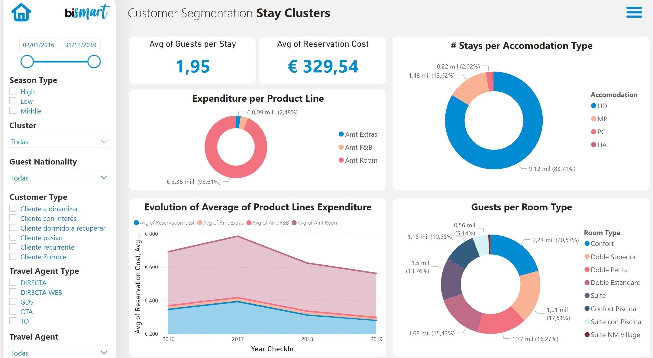
Dashboard de Bismart Customer Segmentation
3. Consider the audience
As mentioned above, when developing a dashboard, it is essential to be mindful of who you are targeting. Clearly, finance dashboards will not be similar to marketing dashboards, and internal analysis dashboards are likely to be very different from those presented to a customer.
Context must also be taken into account. It is not the same to consult a dashboard quietly from an office as it is to view it on your mobile phone between meetings or to present it in front of the management team. It is necessary to take into account the context in which it will be consulted in order to be able to highlight certain data, concentrate efforts on the mobile version, etc. It is also vital to know the purpose of the dashboard in order to choose the best visuals and layout.
4. Don't overdo it
In a dashboard, clarity and order are paramount. We can be tempted to use as many charts as possible to show all the data. However, this can lead to disorganised and dashboards, with letters and numbers that are too small and difficult to read. Too much information can confuse people and make the information difficult to read.
5. Highlight what's important
Although all the charts on a dashboard provide information, there are certain data that summarise key information. In these cases, it is best to use a typography and a size according to their relevance so that they can be seen at first glance. Also, when using numbers, it is advisable to round amounts as much as possible. For example, if the total turnover is €14,089,323.98, simply putting €14.1M will be much more effective. Wheen in need of the specific number, the interested user can always refer the source of information.
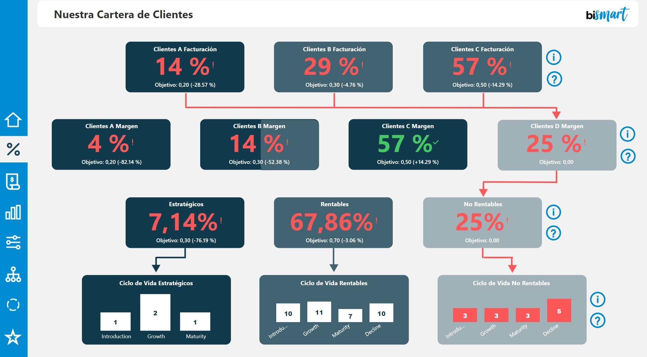 Dashboard de Bismart ABC Client Analysis
6. Consider charts' reading order
In the West, the reading direction is from left to right by default. This is an aspect to take into account when organising visuals, both to ease the reading process and to plan the order in which the information is to be presented.
7. Define a colour palette
To create an effective dashboard we must pay attention to the design. The aim is not to make it look pretty, but to make the information understandable. Colours are a great help in promoting understanding of the charts. However, using too many or too few colours can be detrimental and complicate the understanding and navigation of the dashboard. It is important to define a palette of colours that allows the data to be easily understood without becoming a tidal wave of multi-coloured blobs. In addition, and especially when working for a client, it is always a good idea to adapt the colours to those of the brand we are working for.
8. Be consistent with time windows
The date ranges used in the dashboard should be consistent and make sense for the data displayed. They should also be well labelled, legible and clearly presented.
9. Use space strategically
As we have already seen, too much information impedes understanding. However, sometimes it is not possible to reduce the amount of information. In these cases, it is convenient to take advantage of the information expansion functionalities offered by Power BI so that our dashboard is not overloaded, but it includes all the necessary information.
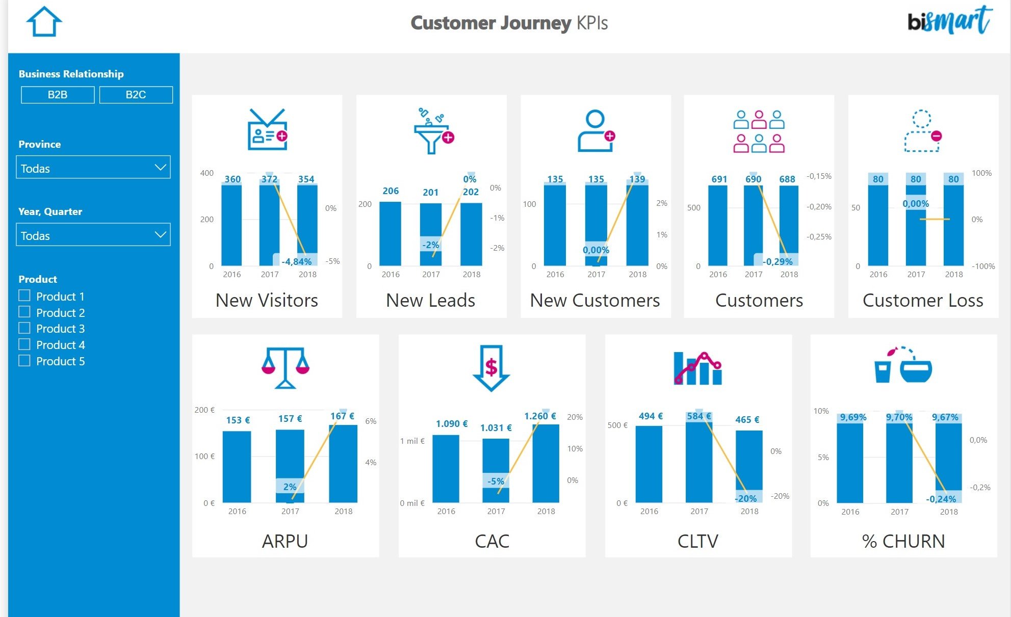
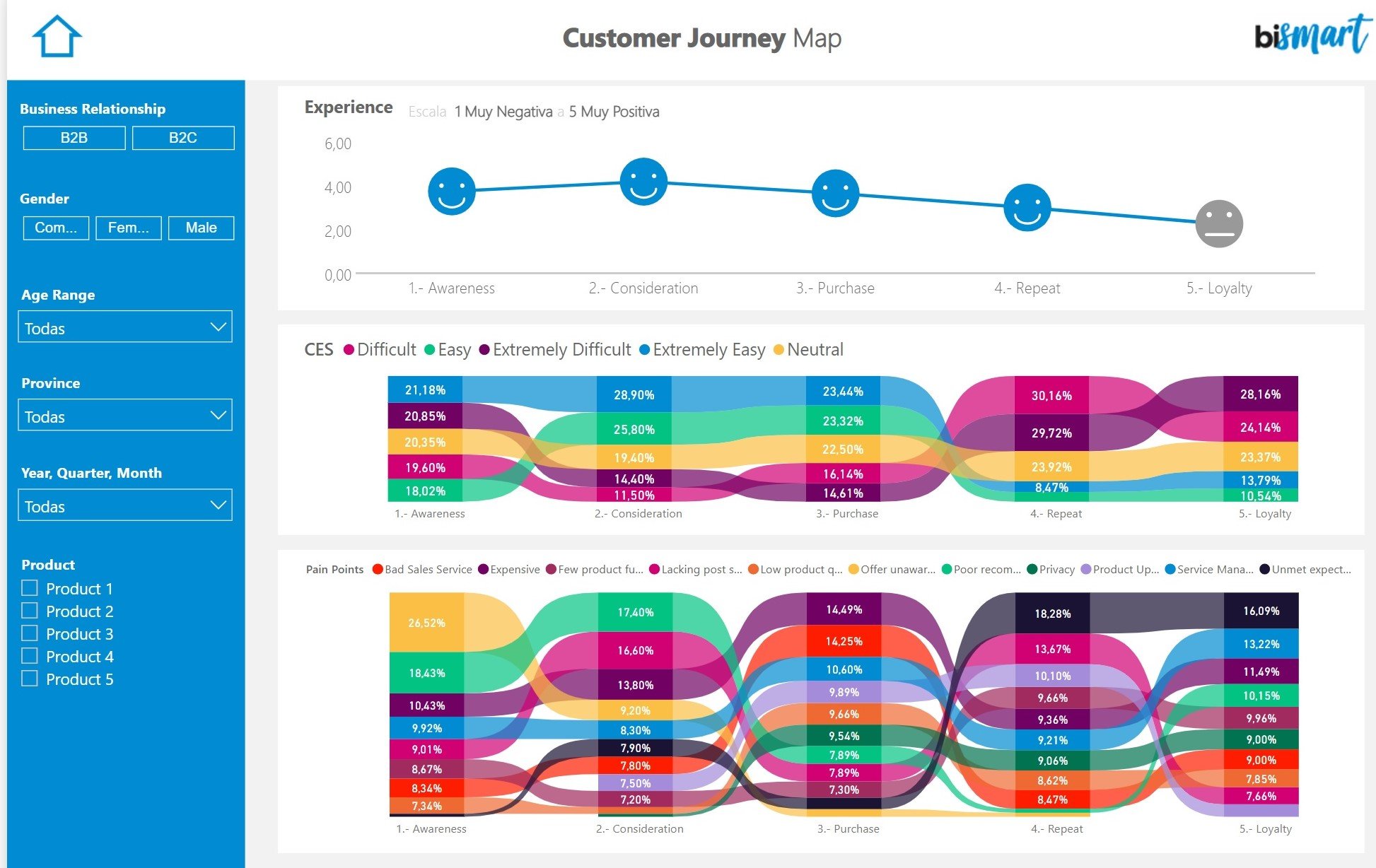
Dashboard de Bismart Customer Journey
10. Be consistent
For recurring dashboards —that we create from time to time— it isdesirable to use the same metrics if possible. In the case of business performance dashboards, for example, changing the indicators on a regular basis would prevent us from knowing the evolution of our activity and, in turn, would be totally unproductive. The way the information is calculated and presented must not vary too much either.
Maintaining a certain consistency in terms of metrics used, colours, visuals, charts, titles and the information's layout is always more appropriate.
11. Storytelling
An optimal dashboard is a dashboard that tells a story. Leveraging the technological capabilities of BI tools to apply storytelling will allow us to develop more powerful, moving and inspiring dashboards. Ultimately, the purpose of a dashboard is not just to represent information, but to inspire others to make informed decisions that drive the business forward. In this sense, stories are always in our favour and help us communicate messages in a more meaningful way.
To create a dashboard that tells a story, the main thing is to be clear about what you want to tell and subordinate the text, data and visualisations to your story.
Moreover, every business is different and, consequently, every dashboard should be different too. When creating a dashboard, keeping business logic in mind is essential. Applying business logic to the criteria for content, visualisation, order of information and highlights will help make the dashboard more accessible and audience-friendly.
12. Validate usability with the target
The best way to know if a dashboard is good or not is to validate it with the end user or target. No one better than the end user will be able to identify areas for improvement, examine the readability of the information and advise on possible improvements.
Bismart has a team of experts in creating BI dashboards. We specialise in data analysis and business intelligence focused on helping companies turn data into insights and offering solutions that improve their productivity. If you need help or would like to make any kind of enquiry, don't hesitate to contact us!