Discover how to apply data storytelling techniques to your dashboards to transform data into decisions. Learn how to design action-oriented dashboards.
In the age of data, business dashboards should be designed using data storytellingtechniques . Data storytelling converts metrics into clear narratives that guide the reader to actionable conclusions.
According to this technique, a dashboard is not just about displaying data in a visually appealing way, but about structuring the information in such a way that decision makers and business professionals can quickly understand what is happening, why it is happening and what actions to take about it.
Awell narrated dashboard turns data into insights. By integrating storytelling techniques into a dashboard, we make the audience remember the information better and connect emotionally with it.
In this article we exploit data storytelling techniques and best practices to take your dashboards from informing to inspiring decisions.
What is Data Storytelling in Business Dashboards?
Data storytelling is a technique that transforms dashboards into visual narratives that explain what is happening, why it is happening and what decisions to make. It combines data visualization, context and narrative structure to facilitate data-driven decision making.
In a more theoretical sense, data storytelling is the art of constructing a compelling narrative from complex information, relying on data visualization to communicate a message to a given audience.
In the context of dashboards, it involves designing interactive dashboards that tell a story: each visualization should support a key point and all together should take the reader through a logical path, from a contextual introduction to an actionable conclusion.
A well-constructed dashboard not only represents information, it tells a story andconveys a meaningful message. At the end of the journey, the reader should understand what is going on and be inspired to make an informed decision based on data.
Do not confuse Data Storytelling with QA systems or Copilot-type assistants.
It is important to distinguish data storytelling from other analytics functionality such as question and answer (QA) systems or AI-based wizards like Microsoft Copilot or the older Power BI Q&A.
These tools allow you to ask questions directly to the dashboard-for example, "Why were sales down in April?"-and get an automatically generated answer in natural language. While useful for ad-hoc exploration of data, they are no substitute for a well-constructed visual narrative.
A storytelling dashboard doesn't wait for the user to ask: it anticipates key questions and guides logically and visually to relevant insights.
While QA answers specific questions, data storytelling creates a coherent story right from the start: it contextualizes, simplifies and highlights what is important so that the user understands what is happening, why and what to do about it, without the need to interact.
Both approaches are complementary, but serve different functions. If you combine a powerful narrative design with interactive tools like Copilot, you will be maximizing the impact of your dashboards.
Benefits of Data Storytelling
In most organizations there is a gap between the abundance of data and the ability to make decisions with it.
Often, we have so many reports and metrics that we fall into the "data overload paradox" where, ironically, information overload leads to inaction.
Storytelling with data acts as a bridge to bridge that gap, structuring data into a logical and persuasive narrative that makes it easier to interpret patterns, gain insights and, above all, implement concrete actions.
In addition, telling stories with data helps to distill and simplify complex information.
Good data storytelling simplifies the complicated so that the audience can assimilate it and make decisions more quickly and confidently. It also adds a "human touch" to the numbers: contextualizing the numbers with stories or examples gives them relevance and creates connection.
In fact, it is proven that people remember data better when it is part of an immersive narrative, rather than presented as isolated statistics ("Made to Stick" - Chip Heath & Dan Heath).
15 Data Storytelling Techniques and Best Practices to Create Effective Dashboards
An effective dashboard narrative does not emerge by chance. It requires deliberately applying principles of visual design, data communication and data-driven analytics to make data-driven decisions.
Here are the key data-driven storytelling techniques that will enable you to transform your reports into interactive dashboards that drive data-driven business decisions.
1. Define the purpose of the dashboard

Every story starts with two key elements: what you want to tell and to whom. Before designing a dashboard, ask yourself:
- What is the main message or key insight the user should take away?
Without a defined objective, we run the risk of building a generic report that does not solve any specific need.
Having a clear narrative objective will allow you to focus the dashboard on the really relevant data, avoiding information overload.
Practical tip: write a short sentence that summarizes the purpose of the dashboard, as if it were your "headline". This will help you keep the focus throughout the design.
2. Know your audience

Each professional profile interprets data differently. It is not the same to design a dashboard for a CEO than for a marketing team, as they will have different needs.
When designing a dashboard, we must adapt the complexity, language and visualization format to the profile of the audience.
💡 Don't miss: Types of Dashboards According to Audience
Best practices for this technique:
- Use simple language familiar to non-technical users.
- Include only key metrics for the business.
- Highlight what really matters and discard the irrelevant.
- Make sure that anyone, regardless of their technical level, can understand the dashboard.
Focus on answering your audience's real questions:
Are we doing well or poorly? Why is this happening? What action should I take?
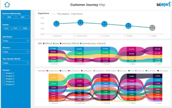
3. Structure the dashboard story: introduction, development and conclusion.
.jpg?width=1472&height=552&name=Quiero%20una%20imagen%20horizontal%20que%20represente%20la%20idea_%20data%20storytelling.%20Estilo%20minimalista%20pero%20realista%20(fotografia).jpg)
One of the most powerful data storytelling techniques is to apply the classic narrative structure to data visualization.
An effective dashboard is not a group of isolated graphs, but a story with a beginning, middle and end. This organization makes it easy for decision makers to follow the thread and extract actionable insights effortlessly.
Introduction: provide context
Start the dashboard with an overview that situates the reader. Use KPIs or a highlight card with the main data.
Example: an "Annual sales vs. target" card on a financial dashboard allows you to quickly understand the overall status (above or below target?).
Development: explain "why"
This is where you break down the information. Add visualizations that show trends, comparisons and segmentations that explain the causes behind the initial data.
Example: graphs by region, product line or time periods that show what factors are driving - or holding back - results.
Conclusion: highlight the action
Close with a key insight or recommendation. It can be a summary graphic, a final indicator or a text that makes the main message clear.
Example: a "Year-over-year cumulative growth" indicator along with a note: "Exceeded target thanks to Q3 performance".

This narrative structure turns the dashboard into a coherent visual story. Each visualization should have a clear purpose within the narrative. Avoid logical jumps and arrange the information in a way that answers the user's questions:
What's happening, why, and now what do we do?
4. Contextualize data
Isolated data can be misleading. Be sure to accompany each visualization with the necessary information to interpret it: units, dates, goals, historical evolution or relevant segmentation.
Example: don't just show "Total sales Q2", but "Sales Q2 2025 (€) vs. annual target".
Remember: an effective dashboard answers from the first glance the question "is this good or bad?"
Best practices for contextualizing your data:
- Always include units and time ranges in titles, axes or legends.
Clear example:
✔ "Sales Q1 2025 (in million €)"
✘ "Sales"
- Compare each performance indicator with a target or previous period.
This way the reader understands whether the current value represents a breakthrough, a drop or an alert.
Example:
"+10% vs. previous year" provides much more than a raw number.
- Support your graphs with brief explanations or comments.
Simple text can make a difference:
"Demand fell in March due to supply issues."
💡 Use interactive resources:
Take advantage of functionalities such as tooltips or pop-up boxes to provide additional details without cluttering the visualization.

This is especially useful for corporate or executive dashboards, such as the balanced scorecard, where clear, quick-to-consume information is valued.
5. Apply the "less is more" principle in data visualization.
One of the pillars of effective data storytelling is simplicity. In data visualization, less is more: showing only relevant information helps the key message stand out without noise or distractions.
A clean, focused dashboard is much more effective than one overloaded with visualizations. Each additional graphic or metric competes for the reader's attention. If you present too many elements, you risk creating confusion, slowing down interpretation and diluting key insights.

Best practices to apply this principle:
- Avoid dashboards with dozens of small or irrelevantcharts .
- Select only the essential data that support your narrative or help you make decisions.
- Eliminate the ancillary: if a visualization doesn't change any decision, it probably shouldn't be there.
- Relegate technical or exploratorydetails to secondary pages, tabs or supplemental reports.
- Ask yourself this key question:
"What decision would be made differently with this data?"
If the answer is none, consider removing it from the main dashboard.
💡 Less does not mean incomplete. It means focusing content on what really matters to the target audience and the desired action. By cleaning up the information, your data-driven story will be clearer, more memorable and more useful for decision making.

Practical Guide: 21 Reporting Tips
Don't miss our exclusive guide where you will find 21 best practices for data visualization.
6. Highlight key information with visual hierarchy and clear design.
One of the golden rules of storytelling with data is that not all data has the same weight. A fundamental part of effective dashboard design is to guide the user's attention to the most important insights.
Techniques to highlight key information:
- Main KPIs in large size and prominent position (top left corner).
- Corporate or contrasting colors for key figures.
- Smaller typography and neutral tones for secondary data.
Example: 14.089.323,98 € → show as 14,1 M€ and leave the detail in a tooltip.
💡 Expert tip: Incorporate explanatory labels or comments within the graph so that the reader immediately understands the highlight.
For example:
"Summer promotion here → sales peak."
These notes function as the "voice of the narrator" within the dashboard and reinforce the visual narrative.
Objective: get the dashboard to speak for itself, without the need for external explanations. When you visually highlight what's important and provide immediate context, your data-driven story becomes clear, understandable and memorable.
8. Summarize insights with notes, labels and annotations.
It is important not to assume that the reader will correctly interpret each graphic. Add brief text within or next to the visuals to explain the message when necessary.
Example: an annotation such as "Here begins the summer campaign → sales increase".
These micro-narratives act as the narrator's voice within the dashboard and reinforce understanding without the need for external explanations.
9. Maintain narrative consistency in colors, fonts and formats.
Visual design in data storytelling is not decoration: it is part of the message. A poorly executed design can distract, confuse or even lead to erroneous interpretations of the data. On the other hand, a coherent and clear design reinforces the visual narrative and the understanding of key insights.
Color palette: communicate with intent.
- Use consistent colors for the same concepts throughout the dashboard.
Example: blue for "sales", red for "costs". - Establish corporate colors or primary and secondary tones in advance.
- Avoid the "rainbow effect": too many different colors make reading difficult.
- Prioritize colors with sufficient contrast to ensure accessibility and legibility.
Typographies and formats: consistency above all.
- Use the same font for titles, labels and body text.
- Use hierarchical sizes to highlight elements (KPI > graphic > annotation).
- Avoid random mixtures of fonts or styles: they give an unprofessional image.
- In corporate dashboards, respect the visual identity of the brand.
10. Choose the right visual for each data
- Prioritize clarity over originality: a well-done horizontal bar is worth more than a confusing 3D graphic.
- Avoid pie charts if they make reading difficult.
- Use the right type of visual according to the purpose:
- Bars or columns: comparison of values.
- Lines: evolution over time
- Maps: geographical distribution
- Cards/KPIs: summarized key indicators

Key tip: maintain consistency in scales, colors and order between similar visuals. This prevents the reader from having to "recalibrate" their attention on each graphic.
11. Try to build a clean design
A good design is invisible: it does not distract, does not saturate, does not complicate.
Apply basic visual design principles (alignment, spacing, hierarchy, contrast) to build a clear, professional and story-focused scorecard.
When design accompanies content, your dashboards don't just look good: they communicate better and facilitate data-driven decision making.
💡 Clean design = fluid storytelling.
12. Leverage interactivity to dive deeper without losing the thread.
Business intelligence tools such as Power BI, Tableau or Qlik allow you to build interactive dashboards with filters, segmentation and dynamic navigation. This interactivity brings a lot of value to explore data, but only if it is used with narrative criteria.
The goal of data storytelling remains the same: to allow the user to go deeper where needed without breaking the thread of the main story.

Guided interactivity with bookmarks and buttons
Functionalities such as bookmarks and navigation buttons allow the design of interactive paths controlled by the report creator.
For example, a "View Q2 analysis" button can take the user directly to that quarter's breakdown, saving them from having to search for the information on their own.
The main message should remain visible
When the user applies filters or explores specific segments (by region, channel, product, etc.), it is critical that the main message remains clear. Some best practices to achieve this:
- Maintain a "back to top" or "reset" option.
- Summarize key findings in each view.
- Don't hide key KPIs during navigation.
A well-narrated interactive dashboard allows you to explore multiple angles of the business without losing the big picture. The visual narrative should guide the user through the key questions: What is happening, why is it happening, what decision should we make?
13. Structure the dashboard as a navigable story
A good dashboard guides the user like a story with chapters. It organizes the information in a hierarchical and sequential way:
- Overview: executive summary with key KPIs that answer "what's happening".
- Detailed analysis: graphs and visualizations that explain "why it's happening".
- Conclusion or recommendation: insights that point to the "what to do".
In Power BI, for example, you can implement this narrative with chained pages that work as a step-by-step story. Accompany each view with informative titles, and if possible, add a navigation menu or visual indicator that helps the user to orient himself within the path.

14. Adapt the narrative to the language and logic of the business.
Storytelling with data must speak the language of your organization. The narrative will be much more effective if it respects the culture and structure of your company.
Practical tips:
- Use the same categories and segmentations that the business uses (by region, channel, product...).
- Use common terms that are familiar to the audience.
- Prioritize KPIs aligned with the company's strategic objectives.
The more familiar the dashboard is to the user, the more easily they will interpret it and the more likely they will act accordingly.
- For example, if "customer" in your company is categorized by region and industry, the dashboard should respect that classification. This semantic consistency makes the data narrative natural and understandable to users.
In short: tell the story of your data using the language of your business, not the analyst's language.
15. Validate the dashboard with representative users
A common mistake is to design dashboards thinking only of the creator. Remember that the dashboard is made for others: business managers, middle management or operational teams.
What to validate:
- Do they understand the story without the need for external explanations?
- Do they detect context gaps, unclear metrics or confusing visualizations?
- Does it really help them make decisions?
Validation will help you detect:
- Misinterpreted charts.
- Metrics that don't answer key business questions.
- Specific needs that were not contemplated.
Itera based on your feedback. Validating the narrative with the target audience is the best way to ensure that your storytelling with data works and generates real impact.
Methodology and Principles to Design Dashboards with Storytelling
At Bismart we apply a structured methodology to create dashboards that combine storytelling with data and technical excellence. Each dashboard we design follows a set of key principles and a collaborative process that ensures both the usefulness and quality of the report.
Key Principles of a Well-Designed Dashboard
1. User-centered design
The report is built with the user in mind: an executive who needs a quick overview is not the same as an analyst who requires more detail. The experience is tailored to the user's profile and real questions.
2. Less is more (visual minimalism)
We only show what is necessary. We avoid overloading with distracting graphics, colors, icons or text. An effective dashboard conveys a lot with little.
3. Context and explanation
Each visualization is accompanied by a clear title, a brief description or a useful tooltip. The goal is for anyone to understand the data and its relevance without ambiguity.
4. Visual consistency
Colors, fonts, sizes and formats are kept consistent throughout the report. This facilitates reading, reinforces the visual identity and avoids interpretation errors.
5. Clarity and purpose
Each graphic should answer a question or show a clear insight. No "just in case" visualizations are included. Everything that appears has a reason.
6. Intuitive interactivity
Filters, buttons, navigation between pages... everything should be easy to use and guide the user through a smooth experience. Interactivity should help, not complicate.
7. Optimal performance
A useful dashboard is one that opens quickly and responds smoothly. Technical optimization is also part of good storytelling with data.
Our Dashboard Design Methodology
1. Discovery: Understanding the business
- We meet with key stakeholders to understand their needs, objectives and context of use.
- We identify the questions the dashboard should answer.
- Result: list of KPIs, relevant metrics, target audience and use cases.
Modeling: Conceptual design of the dashboard.
- We create wireframes or sketches of the dashboard and define the navigation logic.
- We design the data model that supports the report.
- We define interactions, hierarchies, filters and target devices (web/mobile).
- Result: visual prototype + data schema.
3. Construction: Technical development
- We connect sources, perform ETL and model the data.
- Create metrics, KPIs and visualizations according to the approved design.
- We add interactions, drill-downs and bookmarks.
- Result: functional report ready for validation.
4. Validation: Ensure quality and usability
- We perform functional and technical tests (performance, filters, interactivity).
- We validate with real users (UAT) and refine the design according to their feedback.
- Result: dashboard validated and ready for production.
5. Publication and maintenance
- We publish the report in a productive environment with the appropriate accesses.
- We document the operation and define maintenance routines.
- We collect continuous feedback to evolve the dashboard according to future needs.

Conclusion: How to apply Data Storytelling to drive business decisions
In conclusion, applying data storytellingtechniques to effective data visualization can make the difference between a forgettable dashboard and an effective executive report that drives action. We have seen how to define a clear objective, structure the narrative, simplify and highlight what is important, provide context, take care of the visual design and take advantage of the interactivity of tools such as Power BI, all added together, transforms the way we present data.
A dashboard with a data narrative not only answers "what is happening", but also "why is it happening" and "what should we do about it", thus answering the key questions that every decision maker has.
If you avoid common mistakes and follow these business storytelling best practices, you will be on your way to creating dashboards that truly turn data into decisions.
Applying these principles will allow you to significantly improve the effectiveness of your dashboards. Start working today on a clearer, more understandable and decision-oriented presentation of data. Turn your data into a story.