Can you build a Power BI dashboard in 15 minutes? Many try. Discover what’s behind that promise — and how to create dashboards that actually work.
Chances are you’ve come across a message like this before: “Build your Power BI dashboard in just 15 minutes.” Tempting, isn’t it?
But is it really possible to design a corporate dashboard in such a short time?
The answer is no. Despite how often this message appears in ads, courses, and viral videos, the truth is that building a meaningful business dashboard in 15 minutes is impossible.
A Power BI dashboard isn’t just a visual resource — it’s the backbone of business decision-making, the place where data and strategy converge. Reducing its creation to a quick exercise trivializes a tool that, when done right, can make the difference between smart decisions and costly mistakes.
At Bismart, we’ve seen this firsthand. We help organizations tell the difference between a flashy visual and a business intelligence dashboard that truly drives decision-making.
If you want to understand why a “quick and easy” dashboard never works — and how to design a real business dashboard that delivers value — keep reading.
A Dashboard Starts Long Before Power BI
Today’s business environment is complex. A truly effective dashboard — one that guides data-driven decisions and offers a comprehensive strategic view — can’t be built in 15 minutes. Not in an afternoon. Not after a couple of tutorials.
In business intelligence, a successful dashboard doesn’t start in Power BI. It starts with understanding the business. Before opening the tool, you need to grasp what drives the organization, its objectives, the processes that sustain it, and the decisions that need to be supported.
A useful corporate dashboard — whether financial, operational, or enterprise-wide — goes far beyond well-designed visuals. Its value lies not in the graphics themselves, but in the story the data tells and how well that story aligns with the company’s strategy.
What Does a Dashboard Need to Become a Management Tool?
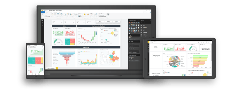
After years of helping organizations build and enhance their analytics foundations, we at Bismart have learned that many business dashboards fail — not because of poor design, but because of how they were built in the first place.
Too often, dashboards are created on disconnected data, ambiguous definitions, and a limited understanding of the business. The result? Visually impressive reports that offer little real value for decision-making.
Below, we explore the key elements required to build dashboards that truly support management decisions and deliver meaningful business insight.
1. Understand the Business: The First Step in Building a Dashboard
The work of a business intelligence consultant doesn’t start with a dataset or a dashboard — it begins with a single, essential question:
“What drives the business, and what needs to be measured to make better decisions?”
That deep understanding — of processes, objectives, and real success indicators — is what separates a strategic BI project from a simple exercise in data visualization.
A skilled consultant translates the language of business into the language of data. This requires dialogue, analysis, and a shared understanding of what “performance” truly means.
At Bismart, every Power BI dashboard begins with a deep understanding of the business: what needs to be measured, why it matters, which data to use, and how best to represent it.
That’s why, before designing any dashboard, our BI consultants immerse themselves in the client’s world — understanding their processes, revenue model, strategic priorities, and measurement culture.
Only then can business objectives be translated into reliable KPIs and robust data models, which are ultimately transformed into dashboards that are genuinely strategic and decision-oriented.
2. Data Integration: The Foundation of Every Dashboard
Before thinking about colors, charts, or filters, think about how your data flows. A dashboard doesn’t begin with design — it begins with the architecture that supports it.
An effective dashboard can only be built on integrated, connected, and governed data. Without solid integration, every department ends up operating with its own version of the truth: sales, finance, and operations working with different numbers, inconsistent indicators, and conflicting conclusions.
At Bismart, data integration is the starting point of every business intelligence project. We design architectures that consolidate information from multiple sources, ensuring traceability, consistency, and continuous updates. Only with a solid foundation can decision-makers trust what they see on screen and make informed, reliable choices.
In business intelligence, there’s a golden rule that never fails: Garbage in, garbage out.
What does "Garbage In, Garbage Out" (GIGO) mean?
“Garbage in, garbage out” means that the quality of your results depends on the quality of your data. In business, using poor data leads to poor decisions — which is why maintaining accurate, reliable information is essential to success.
According to the "Garbage In, Garbage Out" (GIGO) premise, if the input data in a system is wrong, incomplete or of poor quality, the results will be too.
In practice, this means that decisions, analyses, and forecasts are only as good as the data that feeds them.
For example, if a company feeds its business intelligence system or AI model with inaccurate data, it will inevitably produce faulty conclusions, inefficient decisions, and a loss of trust in its reports.
That’s why at Bismart, we place a strong focus on data quality from the very beginning — the integration phase. We apply continuous validation and automated quality controls that prevent the GIGO effect long before it reaches the analytical layer.
3. The Importance of Defining Indicators and Dimensions
Defining what to measure and how to measure it is the foundation of every analytical strategy. A KPI isn’t just a technical formula, it’s an agreement between business and technology on its meaning, frequency, and purpose.
When definitions are vague, every department interprets the numbers differently. The result? Endless meetings debating figures that, while individually correct, don’t align with each other.

The classic scenario: everyone’s right, but no one agrees
Picture a management meeting: Marketing reports $15 million in sales, Operations says $20 million, and Finance insists that, according to their data, the actual number is $17.8 million. Everyone is right — from their own perspective.
The issue isn’t in the calculations, but in the definitions. Are we talking about sales with or without VAT? Invoiced, delivered, or produced orders?
When definitions aren’t aligned, the dashboard stops being a management tool and becomes a source of confusion and debate.
Choosing metrics simply “because they’re easy to calculate” is one of the most common mistakes.
Without a clear conceptual framework — what is being measured, why, how, how often, and who is responsible — the dashboard turns into a collection of meaningless numbers.
When performance indicators fail to answer real business questions, reports stop supporting decision-making. That’s why, at Bismart, we help organizations define, document, and govern their indicators and dimensions from the very beginning.
To build a solid strategic control system, it’s essential to connect corporate objectives with KPIs and action plans. Only then can a dashboard become a true management tool, not just a visual display.
Guide to Evaluate Your Company's Performance
Define a global performance assessment strategy based on Kaplan and Norton's Balanced Scorecard (BSC) model.
Download the free guide and learn the basics to build a balanced scorecard that connects data, performance indicators and strategic objectives to make better decisions.
4. Indicators & Dimensions Definition Tool: The Solution That Prevents Errors and Saves Time
To address this challenge, Bismart developed the Indicators & Dimensions Definition Tool, a solution designed to define, manage, and document business indicators and dimensions in a structured and collaborative way.
The tool enables all departments to speak the same language, eliminating interpretation conflicts that arise when KPIs are poorly defined or inconsistently managed.
It also saves countless hours of manual work and prevents costly errors that are often discovered too late — when the dashboard is already in production.
In short, the Indicators & Dimensions Definition Tool ensures that dashboards align with business strategy, not just with data.
Because a truly effective dashboard isn’t built on formulas, it’s built on consensus, context, and purpose.
Indicators & Dimensions Definition Tool
Discover how Indicators & Dimensions Definition Tool can help you define KPIs with precision and save valuable time in every BI project.
5. From Data to Knowledge: The Real Value of a BI Consultant
A business intelligence consultant doesn’t just connect data sources or design charts. Their true value lies in transforming data into knowledge — connecting the dots between strategy, technology, and business to deliver insights that are useful, sustainable, and reliable.
At Bismart, we accompany organizations through every phase of the dashboard design process, ensuring that every technical decision makes strategic sense:
- We start by understanding the business and its objectives. Only then can we define indicators that measure what truly matters.
- We then document and align metrics, ensuring that all departments speak the same language.
- Next, we integrate and model the data with technical precision, creating a solid and traceable foundation.
- We visualize the information clearly and effectively, so users can interpret it with ease.
- Finally, we govern the system, ensuring its long-term evolution, maintenance, and security.
When each of these steps is aligned, the dashboard stops being a simple report and becomes a true management tool — one that guides business strategy through reliable data and shared understanding.
6. Decision-Oriented Data Visualization
As we often emphasize, data visualization isn’t about creating beautiful dashboards — it’s about designing tools that communicate information clearly, accurately, and with purpose.
When it comes to visualization, less is often more, especially in the use of color. A restrained palette, clear visual hierarchies, and the removal of redundant elements — such as unnecessary filters or slicers — all contribute to better comprehension and faster performance.
A truly effective dashboard doesn’t overwhelm the user; it guides them toward the right decision.
Every chart, every metric, and every visual element must serve a purpose: to help interpret data quickly and enable action.
At Bismart, we apply principles of data storytelling and functional design to ensure that every Power BI dashboard is more than a collection of visuals — it’s a tool that transforms data complexity into knowledge that is accessible, intuitive, and relevant.
7. Governance and Security from the Start
One of the most common mistakes when building corporate analytics systems is assuming that data governance is an optional add-on.
It’s not a final step — it’s a fundamental requirement from day one. Without proper governance, dashboards and analytical environments inevitably face security issues, inconsistencies, and compliance risks.
Defining roles, auditing usage, and documenting datasets from the start helps mitigate risks, ensure regulatory compliance, and guarantee scalability as the system grows.
In today’s enterprise environment, data sharing is essential — but it must be done securely. Sharing critical information across departments, partners, and customers requires robust access controls, data-level security, and governance over the lifecycle of reports and dashboards.
At Bismart, we consider data governance one of the core pillars of our methodology. We don’t treat it as the final phase of a project, but as a foundational element integrated from the very beginning.
Implementing a data governance strategy early on prevents future complications, reduces risk, and ensures the quality, traceability, and consistency of all information within the business intelligence ecosystem.
Our experience has led us to develop our own Data Governance Suite for Power BI, designed to standardize processes, enforce best practices, and provide organized, scalable control of all analytical assets.
- If you’re looking to strengthen the governance of your dashboards, reports, data catalogs, or other critical BI assets, we recommend exploring Governance for Power BI.
Governance for Power BI is the only solution on the market that automates dataset documentation and monitors user activity at scale within Power BI
8. Consistent Operational Performance
The purpose of a dashboard is to deliver the right information to the right person at the right time. If each query takes minutes to load, the dashboard loses its value.
That’s why, when designing a Power BI dashboard, it’s essential to apply reporting best practices that go beyond visual design — focusing instead on performance, efficiency, and user experience.
By optimizing queries, refresh schedules, and calculations — bringing them closer to the data source — you can prevent delays and bottlenecks during critical moments such as financial closings or executive meetings.
- Want more tips like this? Download the Definitive Guide to Reporting and Data Visualization with Power BI!
Guide: Practical Reporting Tips
Optimize the performance and loading time of your reports. Discover the most popular tricks used by experts.
The importance of scalability
An effective dashboard must grow as the business grows: incorporate new metrics, integrate additional sources and allow - when it adds value - direct action from within the BI environment, such as approvals, planning or operational updates.
In this way, the dashboard ceases to be a static panel and becomes a living tool that evolves with the organization, accompanying daily management and adapting to its changing needs.
At Bismart, we conceive each dashboard as an evolving system: scalable, sustainable and future-proof. Because a dashboard should not only show the present, but also grow with the business and anticipate what is to come.
Types of Dashboards: A Tool for Every Decision Level
Beyond the recommendations we’ve already discussed, it’s important to understand that not all dashboards serve the same purpose. Depending on the management level or business area, dashboards can follow different analytical approaches and structures.
If you’d like to learn more, we recommend our article on types of business dashboards, where we explain the main models:
- Balanced scorecard (BSC): connects strategic objectives with performance indicators.
- Executive Dashboard: provides a global, high-level view of organizational performance.
- Analytical Dashboard: allows users to explore data in depth to uncover trends, patterns, and opportunities.
- Operational Dashboard: supports daily process monitoring and tactical performance management.
- Financial Dashboard: focuses on financial control, profitability, and economic insights.
Each of these dashboards serves a different purpose, but they all share a common goal: turning data into actionable knowledge to make better business decisions.
Executive Checklist: How to Spot a Problematic Dashboard in 60 Seconds
- Are your KPIs defined with a clear purpose and an assigned owner?
- Does everyone on the team understand what each metric or chart represents, what data it’s based on, and where the numbers come from?
- Is your data model designed from the start to be secure, stable, and high-performing?
- Does the dashboard use a limited number of visuals and filters to enhance clarity rather than overwhelm users?
- Is there a governance framework that manages access, usage, and report evolution?
- Does the visualization tell a story that helps you make decisions — not just look at data?
If you answered “no” to several of these questions, you’re probably dealing with a dashboard that looks good — but isn’t very useful for running a business.
After working on countless projects across industries, we at Bismart have learned one essential truth:
a dashboard’s value isn’t measured by how many charts it has, but by how many clear decisions it enables.
Conclusion: A Dashboard Is Only the Tip of the Iceberg
A truly effective dashboard isn’t designed in an afternoon or improvised with a couple of tutorials. It’s the result of a much deeper process — one that begins with understanding the business, defining indicators correctly, and ensuring proper data integration.
The true value of a dashboard lies not in its appearance, but in its ability to turn data into business insight, aligning technology and strategy to drive better decisions.
At Bismart, we design dashboards that deliver real impact because we understand the business behind them. Our expertise goes far beyond Power BI. We build intelligent data ecosystems where information flows seamlessly: integrated, consistent, and traceable.
If you’d like to explore examples of our work, download our guide featuring 15 examples of Power BI dashboards, categorized by business need, area, and industry sector:
15 Must-Have Dashboards
Discover the best dashboards of the year in this free guide.
Do You Want Dashboards That Drive Decisions,
Not Just Display Data?
At Bismart, we support organizations throughout the entire journey, from business consulting and data integration to the design and implementation of corporate dashboards.
We even offer custom training programs to ensure successful adoption across teams.
Our key differentiator is that we cover the entire data lifecycle: from data extraction, integration, and modeling, to strategic dashboard creation, governance implementation, analytics automation, and KPI definition.
All of this is done with a consultative approach that bridges technology and business, transforming data into actionable, meaningful insight.
Tell us about your project, we’ll help you make it happen
Other Recommended Resources
- The 15 Must-Have Power BI Dashboards in 2025 — examples and real-world use cases for Finance, Sales, Marketing, HR, and Executive Management.
- 21 Best Practices for Power BI Reporting — essential insights on performance, design, governance, and user experience.
- 10 Best Practices for Self-Service BI — proven strategies for successful Power BI adoption across corporate environments.
- The Definitive Guide to Power BI — your go-to reference for reporting and data visualization best practices.
