We review the 8 most important new features of the latest Zebra BI update (June 2022). Spoiler: You can finally change the font settings!
Zebra BI, a company that provides visuals for Power BI, has just announced an update that includes new capabilities and the optimization of some of its functionalities. We review the 8 most important new features of the latest Zebra BI update.
 Source: Zebra BI
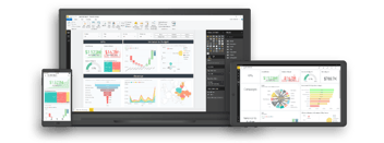
Zebra BI offers unique visuals for Power BI and Excel. The integration of Zebra BI's visuals improves the data visualization and storytelling capabilites of your Power BI reports.
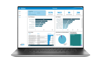
Zebra BI visuals are very powerful and even Microsoft uses them for their internal reporting, as they enable options that Power BI visuals do not have. Zebra BI visuals are especially useful for simplifying complex data and for creating challenging reports such as financial reports.
- Discover the perfect financial report created with Zebra BI in our exclusive guide "CFO's Time: The CFO of the Future."
Zebra BI visuals are regularly updated, as well as the solution's features. At Bismart, as a preferred Power BI partner and a Zebra BI partner, we try to keep users informed about the latest news regarding reporting and the creation of reports and dashboards. In addition, the partnership with Zebra BI ensures that we are providing the best visual solutions to our customers.
This time, we review the 8 most important new features of the latest Zebra BI update. Better dynamic comments, new interactivity controls, new customization options and much more.
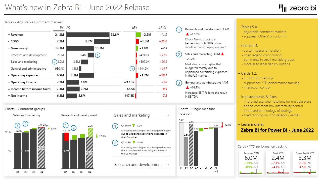
Top 8 new features of Zebra BI 5.4: Enrich data visualization in Power BI and Excel
1. Change the font settings of your Zebra BI Cards
We open the list with one of the most demanded requests from Zebra BI users, who have been long waiting to change the font format of Zebra BI Cards.
Zebra BI has responded to the demands. In the new version of the solution users will be able to change the font (size and color) of pretty much all the labels: titles, values, deviations, etc.
However, we must remind that using too many colors in a visual is never a good idea, as it makes our visuals harder to understand.
This new possibility also allows us to hide the data that we do not want to show in the visual (making the color of the label the same as the background color).
In short, we can now adapt the font of the labels to our needs and brand image.
Source: Zebra BI
How to change the font?
- Open the tool bar and click on 'Fonts'. You will find the font settings there.
2. Dynamic comments markers and interactivity controls
Zebra BI includes a feature, 'Dynamic Comments', which allows comments to be added to Power BI reports and dashboards to make data and visuals more understandable, fostering the democratization of data.
Before the update, comments were automatically assigned to a specific column. With the new version of Zebra BI we can individually assign each of the comments to a specific column through markers.
With this new option, Zebra BI increases the readability and understanding of the comments, as users will now know exactly what each comment refers to.
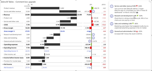
Source: Zebra BI
On the other hand, the new version of Zebra BI allows us to control the interactivity of the comment box. Thus, administrators of a report or a dashboard can now control whether or not end-users are able to modify comments. This prevents the inclusion of errors in the comments and users making unnecessary transformations.
3. Scenario notation in waterfall charts
Zebra BI charts allow us to create dashboards and then standardize them into different reports, applying visual patterns to current data, past periods, plans and forecasts.
Previously, scenario configuration patterns could not be applied to single-level waterfall charts. However, in the new version, we can assign custom visual patterns to this visual as well.
4. Legend color-coding
The legibility of the legends is a fundamental part of understanding the data. Therefore, in version 5.4 of Zebra BI Charts we can set the color of the legends. Thus, we will not have to worry about legibility when we apply custom colors or when the background of our visual is black.
From now on, the legends will be the same color as the lines or columns of the visual.
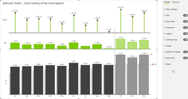
How to activate it?
Design Settings > Format visual > Custom > More colors > Custom Colors (for previous year, forecasts or plan)
Legend > Turn on 'Use colored legend names'
5. Dynamic comments for small multiples
One of the most valued features of Zebra BI is that its visuals contain the most advanced algorithms on the market for rendering small multiples.
Previously, when adding comments on small multiples, only the comments of the first group were displayed. However, Zebra BI has optimized this functionality so that we can also add groups of comments on small multiples.
This way, when we open the comment box in the small multiples, the comments will be separated by groups and we will be able to view the comments of each group in a single click.
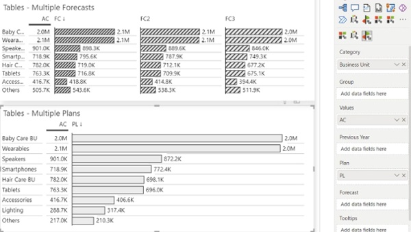
6. Compare plans and forecasts
Zebra BI allows us to compare forecasts and plans with each other. However, before the upgrade, the distinction between the different versions of a plan was not available, even though it was available for forecasts.
With the new version of the tool, we have the possibility to separate the different plans as well. Each value is marked with a different notation following the IBCS guidelines.
This facilitates the handling of multiple plans and forecasts when presenting the data.
Source: Zebra BI
7. Automatic data label density options
Applying the correct density to data labels can be decisive for the understanding of visuals. Including too many labels or labels that are too large or highlighted can hinder the readability of the visual.
The new version of Zebra BI Charts includes new options for setting the density of data labels, which are automatically adjusted.
This way we can now adjust the density of the labels —highest, high, medium and low— for any type of chart. If we change the size of the visual, the labels will be adjusted automatically.
8. New interaction settings
One of the main advantages of Zebra BI is that it allows us to add labels to the visuals in a simple and interactive way. However, this interactivity can sometimes be problematic as it can cause end-users to change the size, content or format of the labels by mistake.
To address this issue, Zebra BI has enabled a new feature that allows us to control the level of end-user interactivity.
Summing up
The new version of Zebra BI optimizes dynamic comments, the personalization and the interaction control for waterfall charts, cards and small multiples.
If you want to see a demonstration of how to activate or apply the new features, watch the following video:
In this article we have reviewed the 8 most important new features of Zebra BI's new update. However, you can consult the complete list of changes, improvements and bug fixes in the solution's changelog.